Foundations of
Data Science

Spring 2026 | Data 2 (399)
Jeffrey M. Girard | Lecture 05b

Roadmap

  • Combine layers of overlapping geometric objects

  • Learn aesthetic setting, mapping, and grouping

Setup

library(tidyverse)
data("mpg", package = "ggplot2")

glimpse(mpg)
Rows: 234
Columns: 11
$ manufacturer <chr> "audi", "audi", "audi", "audi", "audi", "audi", "audi", "…
$ model        <chr> "a4", "a4", "a4", "a4", "a4", "a4", "a4", "a4 quattro", "…
$ displ        <dbl> 1.8, 1.8, 2.0, 2.0, 2.8, 2.8, 3.1, 1.8, 1.8, 2.0, 2.0, 2.…
$ year         <int> 1999, 1999, 2008, 2008, 1999, 1999, 2008, 1999, 1999, 200…
$ cyl          <int> 4, 4, 4, 4, 6, 6, 6, 4, 4, 4, 4, 6, 6, 6, 6, 6, 6, 8, 8, …
$ trans        <chr> "auto(l5)", "manual(m5)", "manual(m6)", "auto(av)", "auto…
$ drv          <chr> "f", "f", "f", "f", "f", "f", "f", "4", "4", "4", "4", "4…
$ cty          <int> 18, 21, 20, 21, 16, 18, 18, 18, 16, 20, 19, 15, 17, 17, 1…
$ hwy          <int> 29, 29, 31, 30, 26, 26, 27, 26, 25, 28, 27, 25, 25, 25, 2…
$ fl           <chr> "p", "p", "p", "p", "p", "p", "p", "p", "p", "p", "p", "p…
$ class        <chr> "compact", "compact", "compact", "compact", "compact", "c…

Layering

Layering

  • ggplot2 uses a layered grammar of graphics
    • We can keep stacking geoms on top
  • Layering adds a lot of possibilities
    • We can convey more complex ideas
    • We can learn more about our data
  • But we can still describe these graphics
    • Just describe each layer in turn
    • And describe the layers’ ordering

The Smooth Geom

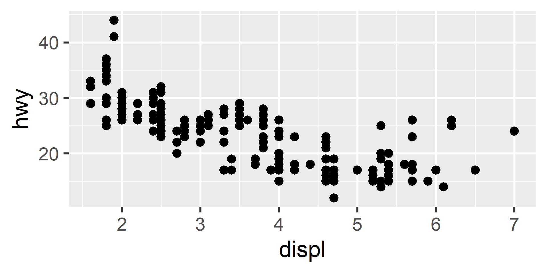
# Left: Point geom plots all the observations
ggplot(mpg, aes(x = displ, y = hwy)) + geom_point()
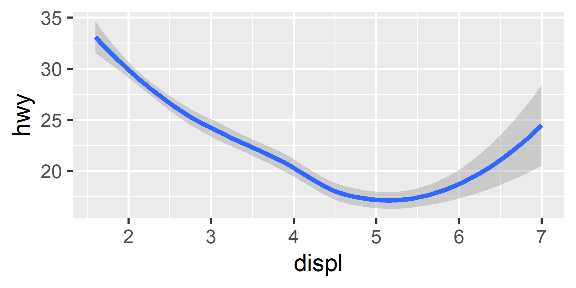
# Right: Smooth geom plots a local line-of-best-fit
ggplot(mpg, aes(x = displ, y = hwy)) + geom_smooth()

Overlapping the Layers

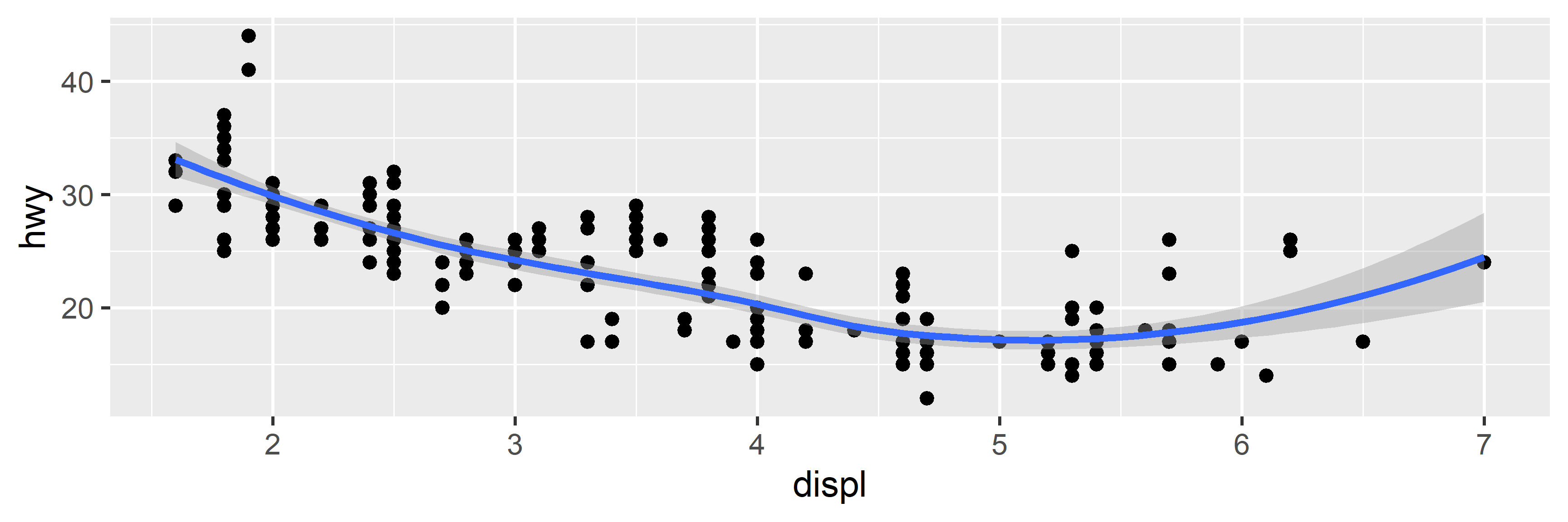
# Adding additional geoms stacks their layers on top
ggplot(mpg, aes(x = displ, y = hwy)) +
  geom_point() + 
  geom_smooth()

Economics Dataset

data("economics", package = "ggplot2")

glimpse(economics)
Rows: 574
Columns: 6
$ date     <date> 1967-07-01, 1967-08-01, 1967-09-01, 1967-10-01, 1967-11-01, …
$ pce      <dbl> 506.7, 509.8, 515.6, 512.2, 517.4, 525.1, 530.9, 533.6, 544.3…
$ pop      <dbl> 198712, 198911, 199113, 199311, 199498, 199657, 199808, 19992…
$ psavert  <dbl> 12.6, 12.6, 11.9, 12.9, 12.8, 11.8, 11.7, 12.3, 11.7, 12.3, 1…
$ uempmed  <dbl> 4.5, 4.7, 4.6, 4.9, 4.7, 4.8, 5.1, 4.5, 4.1, 4.6, 4.4, 4.4, 4…
$ unemploy <dbl> 2944, 2945, 2958, 3143, 3066, 3018, 2878, 3001, 2877, 2709, 2…

Line Geoms for Time Series

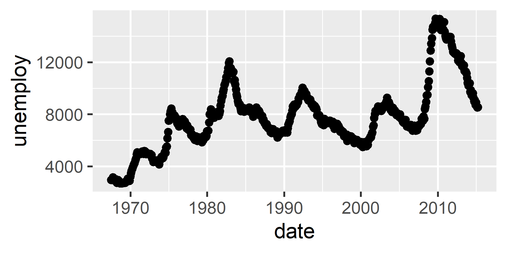
# Left
ggplot(economics, aes(x = date, y = unemploy)) + geom_point()
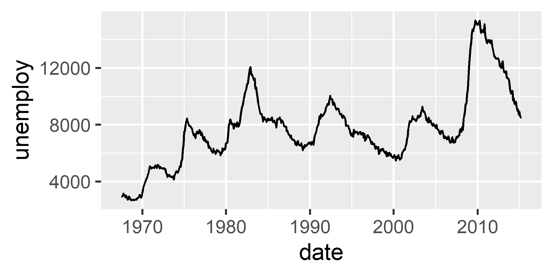
# Right
ggplot(economics, aes(x = date, y = unemploy)) + geom_line()

Adding Reference Lines

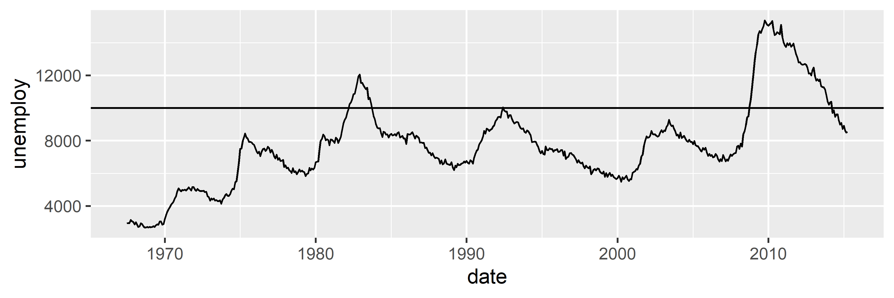
# Add a horizontal reference line at y=10000
ggplot(economics, aes(x = date, y = unemploy)) + 
  geom_hline(yintercept = 10000) +
  geom_line()

Aesthetics

Aesthetics

  • Aesthetics control a geom’s appearance
    • points: color, shape, size, …
    • smooths: color, linetype, linewidth, …
  • There are two ways to control aesthetics:
    • You can set it to a value
      • It will take on one value only
      • e.g., all points = red
    • You can map it to a variable
      • It will take on different values
      • e.g., sedans = red, trucks = blue

Setting Color

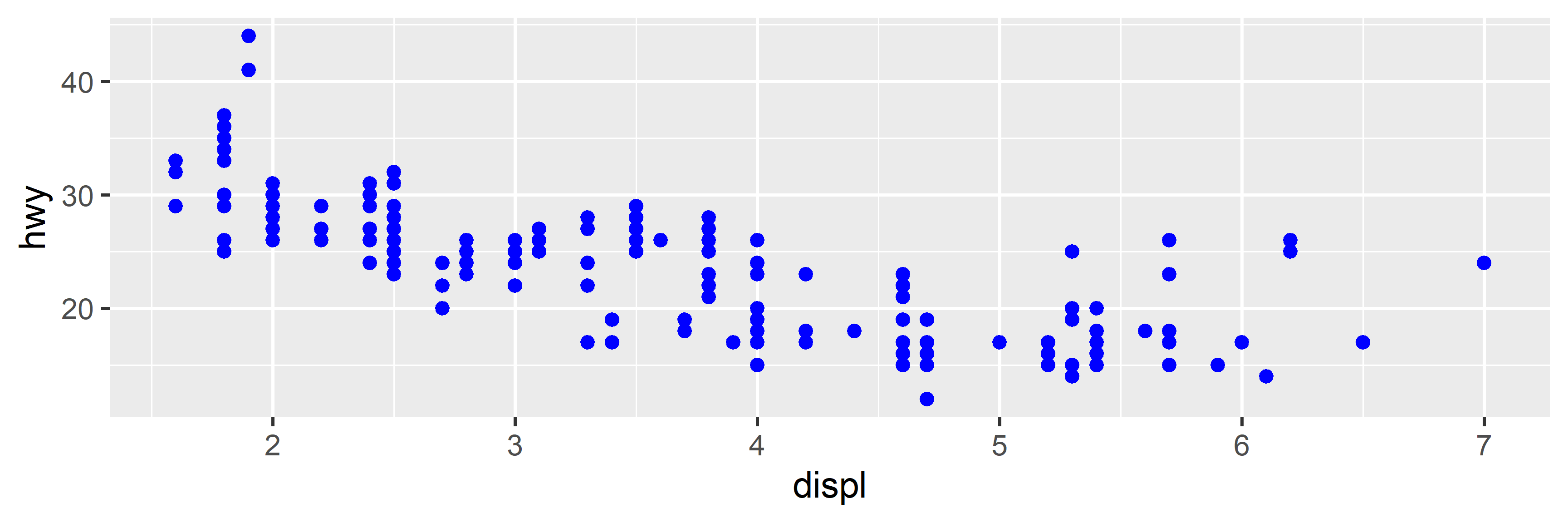
# Set color inside geom_*() to apply it to all points
ggplot(mpg, aes(x = displ, y = hwy)) +
  geom_point(color = "blue")

Mapping Color

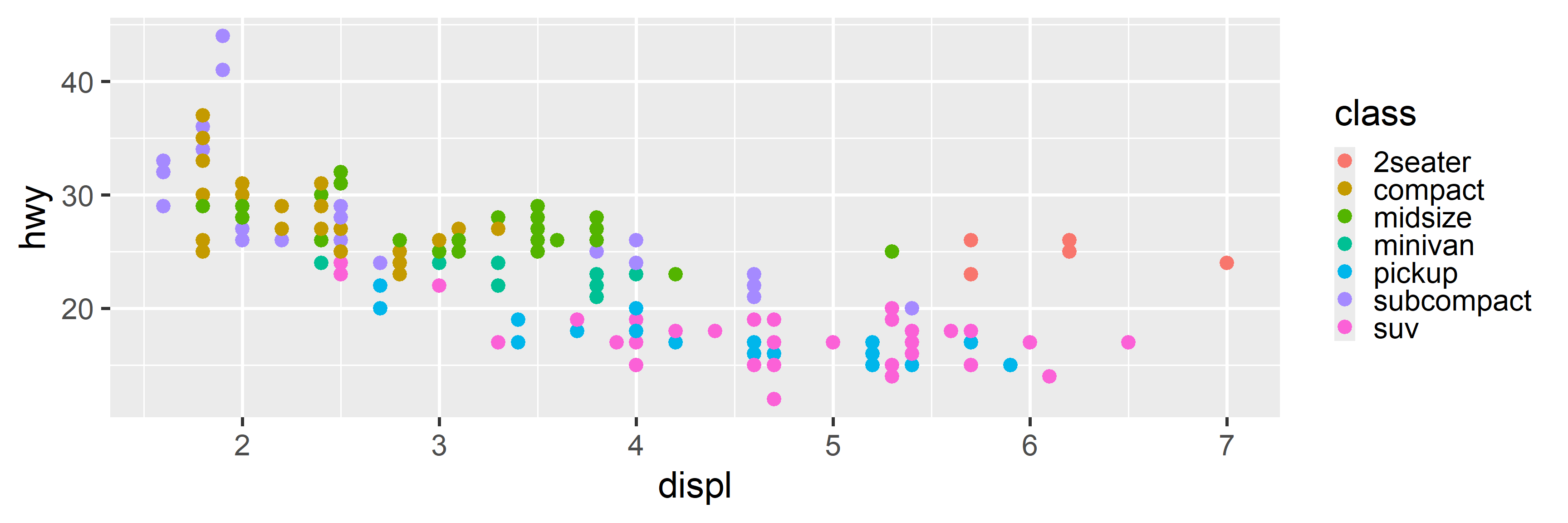
# Map color to a variable within aes() to have it vary
ggplot(mpg, aes(x = displ, y = hwy, color = class)) +
  geom_point()

Pitfall: Setting in aes

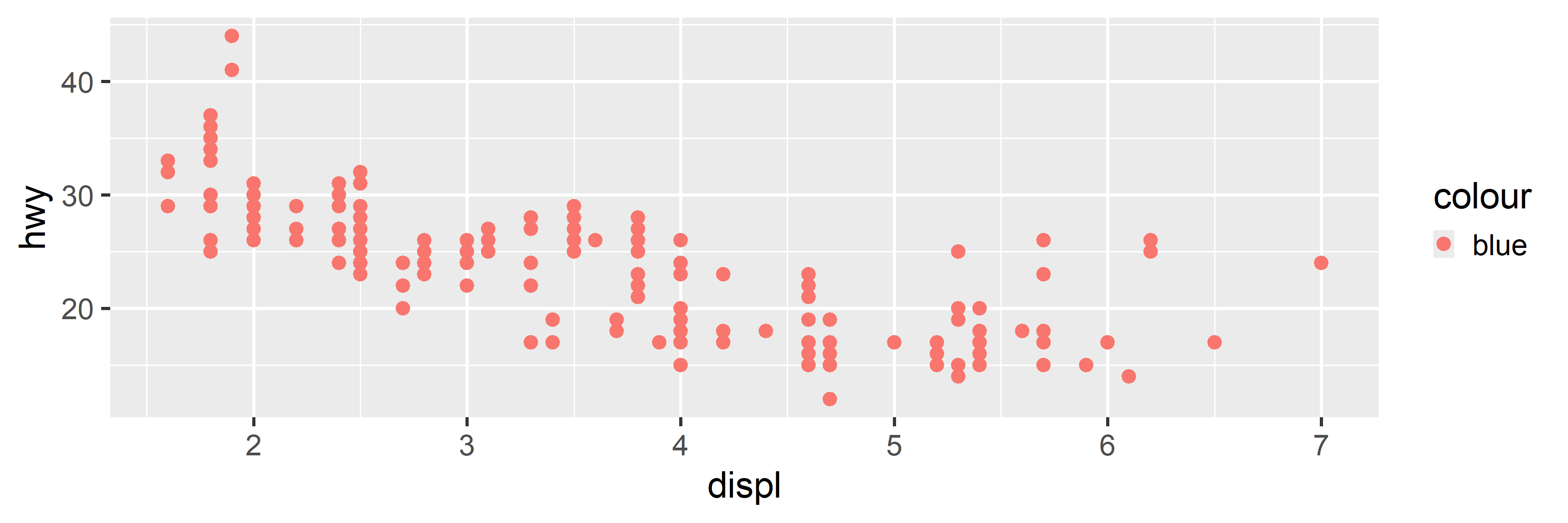
# Don't try to set an aesthetic inside aes()
ggplot(mpg, aes(x = displ, y = hwy, color = "blue")) + 
  geom_point()

Pitfall: Mapping in geom

# Don't try to map an aesthetic outside of aes()
ggplot(mpg, aes(x = displ, y = hwy)) + 
  geom_point(color = class)
Error in `geom_point()`:
! Problem while setting up geom aesthetics.
ℹ Error occurred in the 1st layer.
Caused by error in `list_sizes()`:
! `x$colour` must be a vector, not a primitive function.
ℹ Read our FAQ about scalar types (`?vctrs::faq_error_scalar_type`) to learn more.

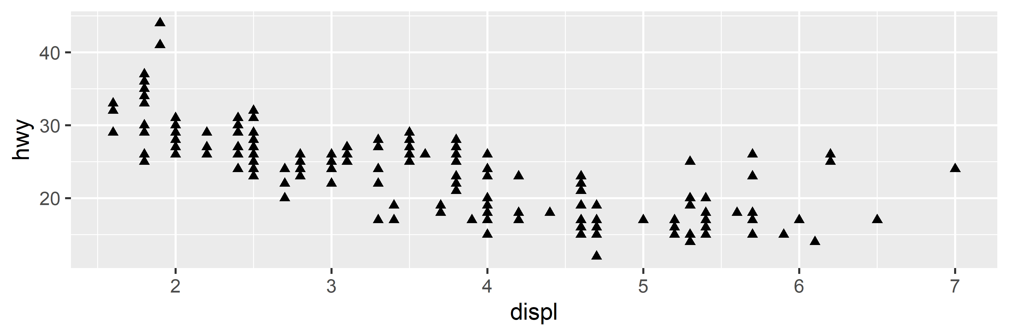
Setting Shape

# Set the shape inside geom_*() to "triangle"
ggplot(mpg, aes(x = displ, y = hwy)) + 
  geom_point(shape = "triangle")

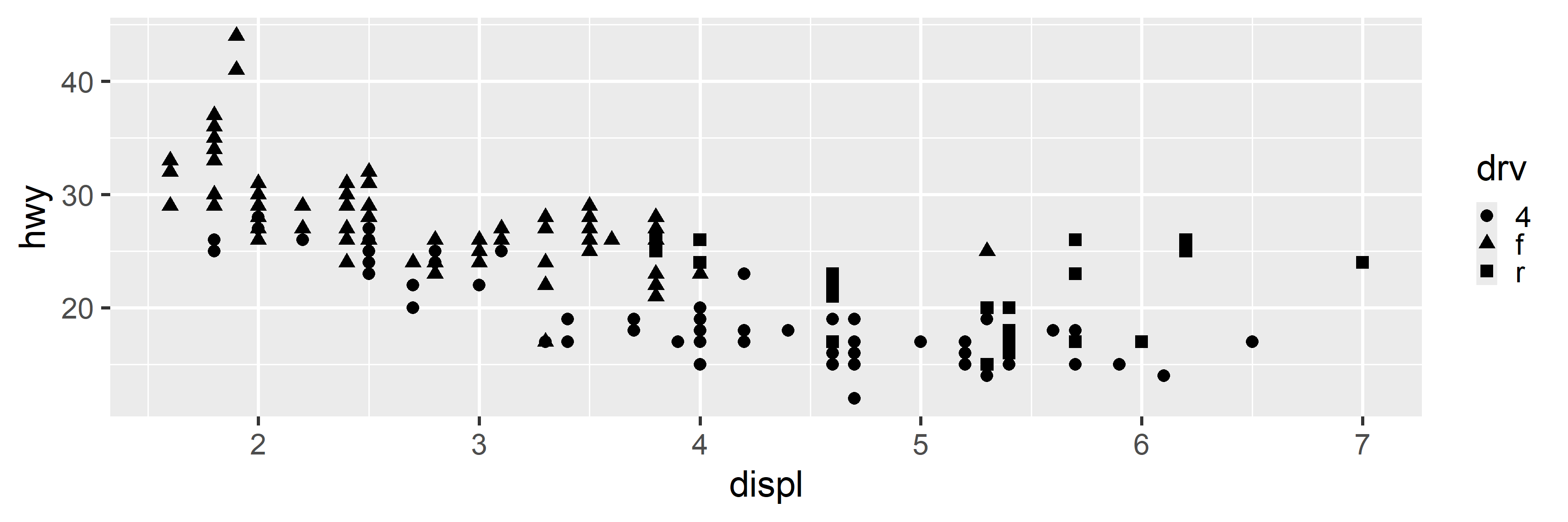
Mapping Shape

# Map shape to the drv variable inside aes()
ggplot(mpg, aes(x = displ, y = hwy, shape = drv)) + 
  geom_point()

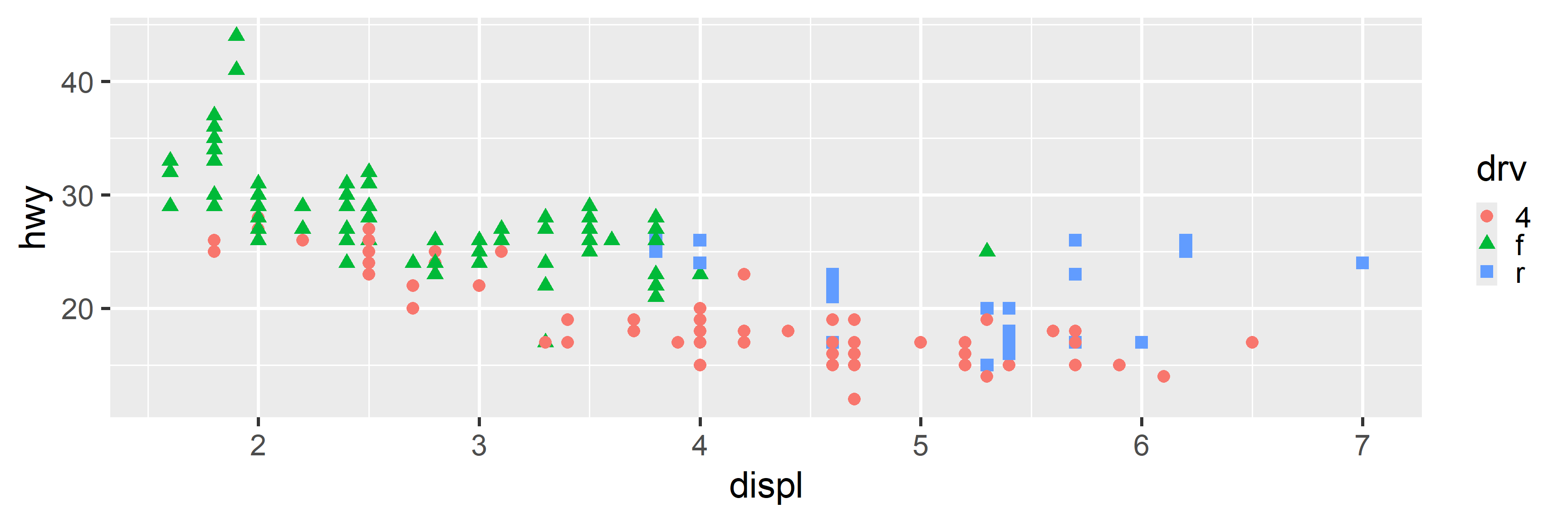
Redundant Mapping

# Map both shape and color to the drv variable
ggplot(mpg, aes(x = displ, y = hwy, shape = drv, color = drv)) + 
  geom_point()

Other Useful Aesthetics

  • size
    • Geoms: point, text
    • Action: Controls point or font size
  • alpha
    • Geoms: All
    • Action: Controls transparency
      (0 = invisible, 1 = opaque)
  • linewidth
    • Geoms: line, smooth
    • Action: Controls line thickness
  • linetype
    • Geoms: line, smooth
    • Action: Controls line pattern
      (solid, dashed, dotted)

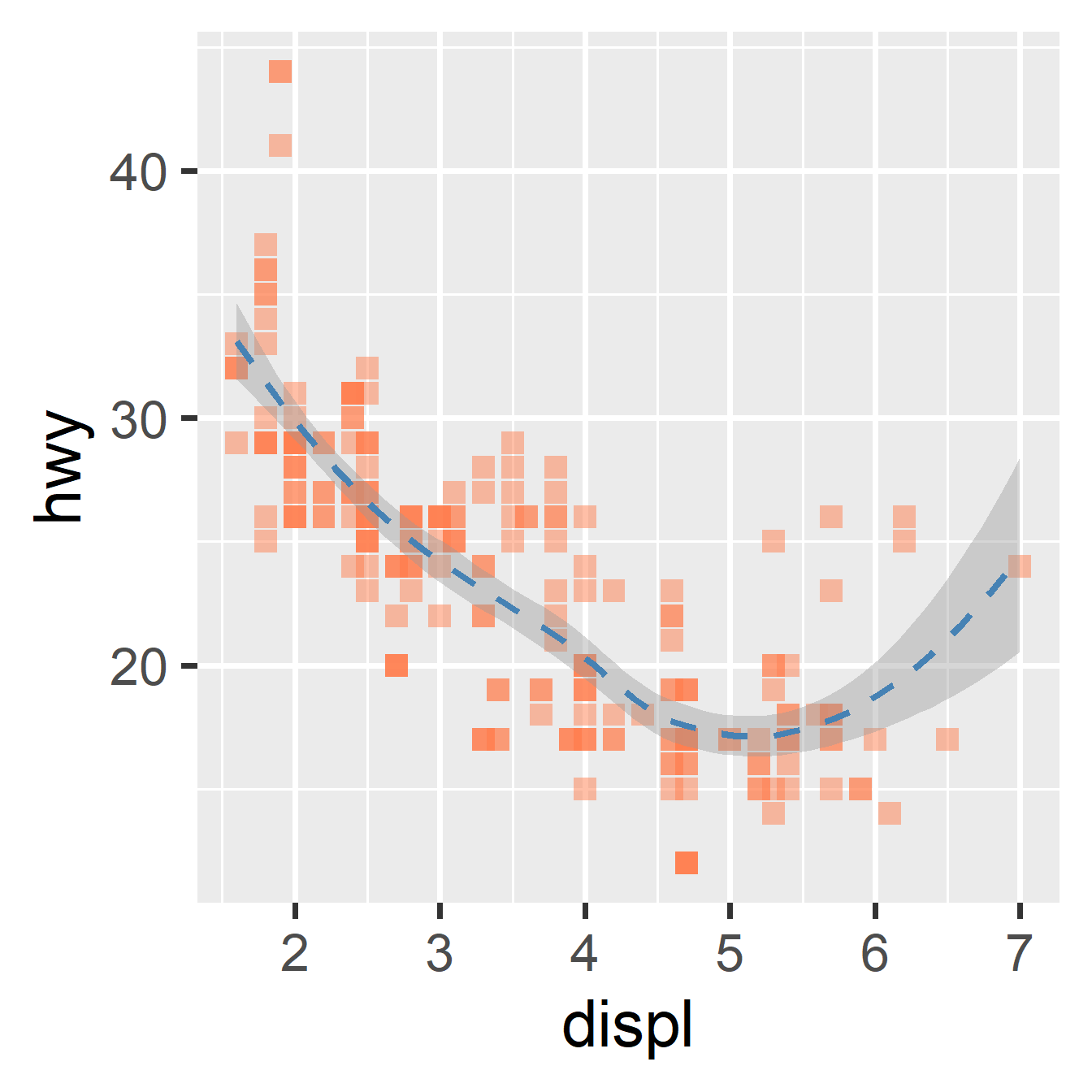
Aesthetics in Action

ggplot(
  mpg, 
  aes(x = displ, y = hwy)
) +
  geom_point(
    size = 4,
    color = "coral",
    shape = "square",
    alpha = 0.5
  ) +
  geom_smooth(
    color = "steelblue",
    linewidth = 1.5,
    linetype = "dashed"
  )

Aesthetics in Action

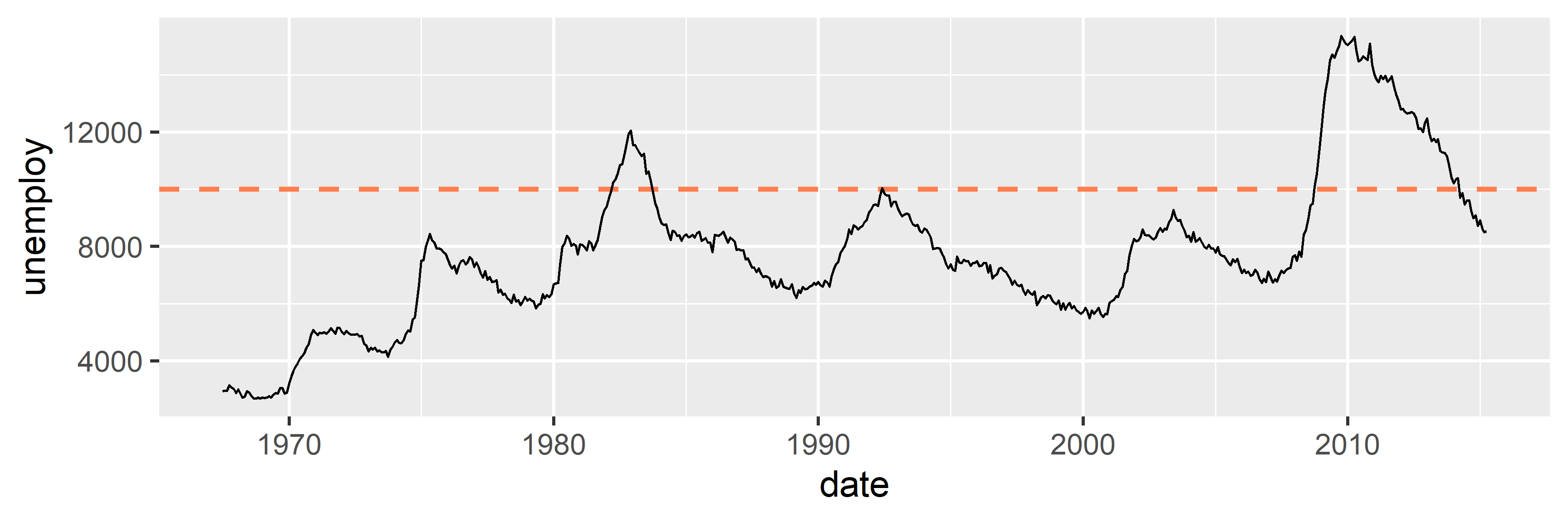
ggplot(economics, aes(x = date, y = unemploy)) + 
  geom_hline(yintercept = 10000, color = "coral", 
             linetype = "dashed", linewidth = 2) +
  geom_line(linewidth = 1)

Grouping

Implicit vs. Explicit Grouping

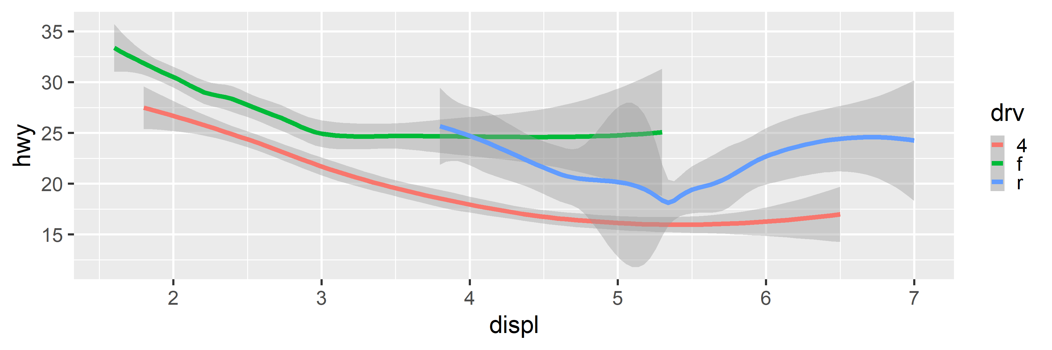
  • Grouping controls how functions (like geom_smooth or geom_line) analyze your data.
    • Do we calculate one trend or many?
  • Implicit Grouping (via color, shape, etc.)
    • Mapping a variable to appearance automatically groups the data.
    • Result: Separate geoms + a Legend.
  • Explicit Grouping (via group)
    • Mapping a variable to group groups the data without changing appearance.
    • Result: Separate geoms + No Legend.

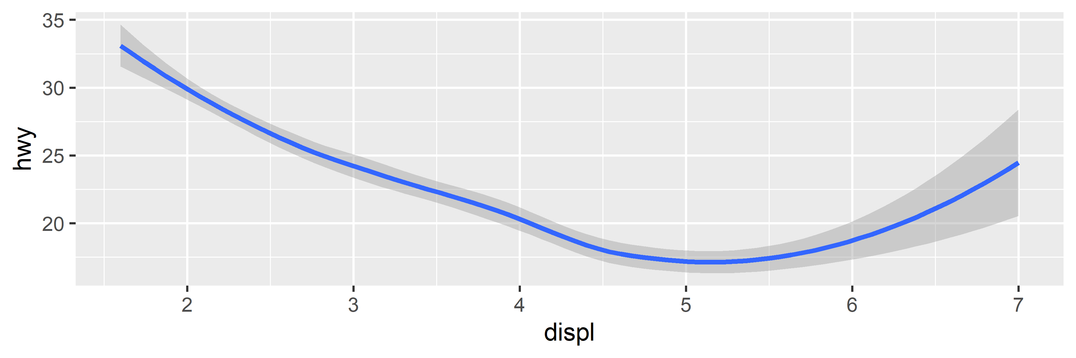
Smooth (No Grouping)

# No color mapping leads to a smooth for all datapoints
ggplot(mpg, aes(x = displ, y = hwy)) + geom_smooth()

Smooth (Implicit Grouping)

# Mapping color to drv leads to a separate smooth for each group
ggplot(mpg, aes(x = displ, y = hwy, color = drv)) + geom_smooth()

ChickWeight Dataset

data("ChickWeight", package = "datasets")

glimpse(ChickWeight)
Rows: 578
Columns: 4
$ weight <dbl> 42, 51, 59, 64, 76, 93, 106, 125, 149, 171, 199, 205, 40, 49, 5…
$ Time   <dbl> 0, 2, 4, 6, 8, 10, 12, 14, 16, 18, 20, 21, 0, 2, 4, 6, 8, 10, 1…
$ Chick  <ord> 1, 1, 1, 1, 1, 1, 1, 1, 1, 1, 1, 1, 2, 2, 2, 2, 2, 2, 2, 2, 2, …
$ Diet   <fct> 1, 1, 1, 1, 1, 1, 1, 1, 1, 1, 1, 1, 1, 1, 1, 1, 1, 1, 1, 1, 1, …

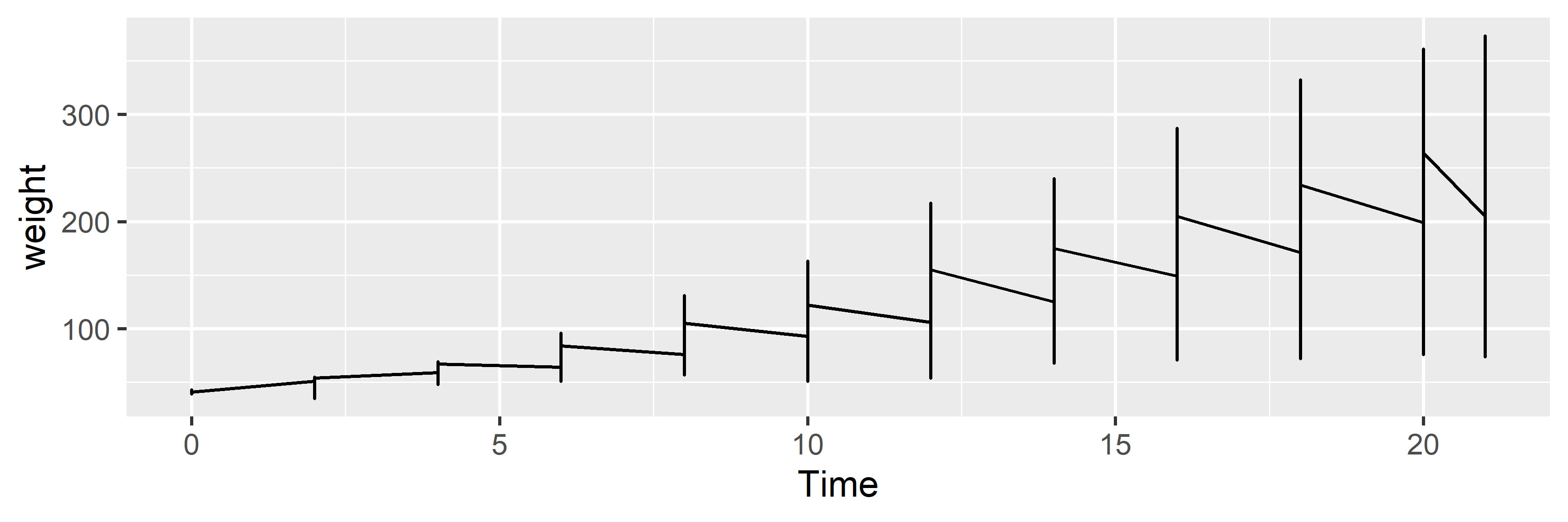
Line Series (No Grouping)

# Without grouping, we get an incomprehensible line for all Chicks
ggplot(ChickWeight, aes(x = Time, y = weight)) + geom_line()

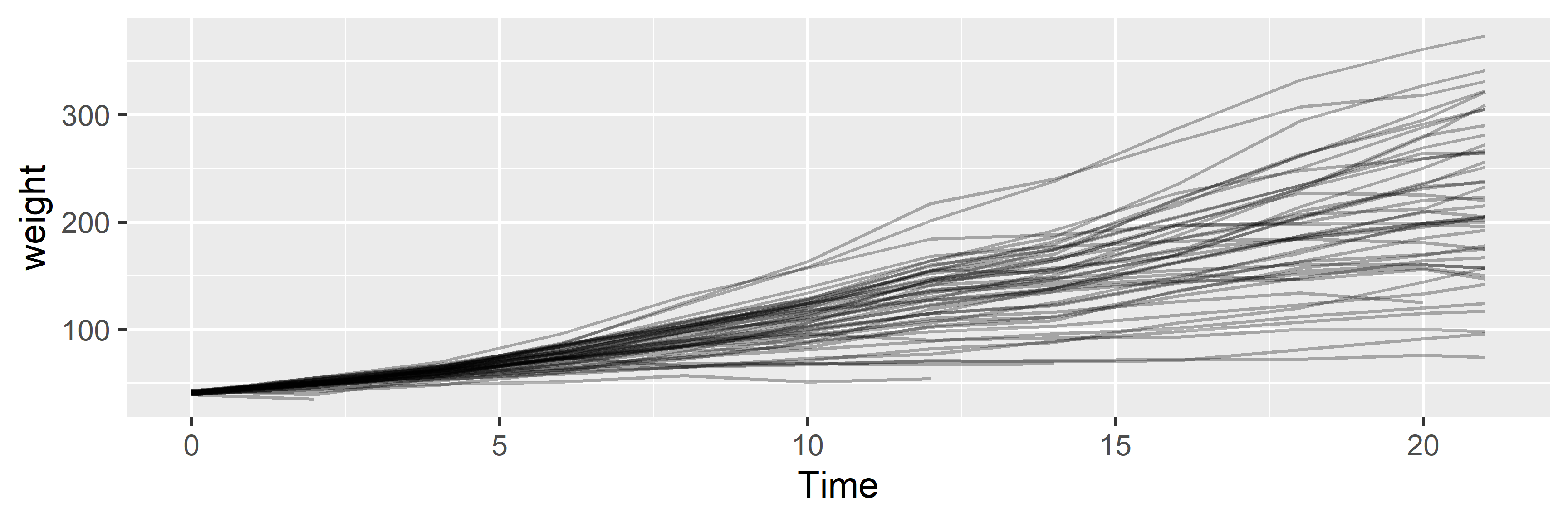
Line Series (Explicit Grouping)

# But with explicit grouping, we get a separate line per Chick
ggplot(ChickWeight, aes(x = Time, y = weight, group = Chick)) + 
  geom_line(alpha = 0.3)