Foundations of
Data Science

Spring 2026 | Data 2 (399)
Jeffrey M. Girard | Lecture 05c

Roadmap

  • Visualize the distribution of a single variable

  • Visualize the relationship between two variables

Setup

library(tidyverse)
data("penguins", package = "datasets")

glimpse(penguins)
Rows: 344
Columns: 8
$ species     <fct> Adelie, Adelie, Adelie, Adelie, Adelie, Adelie, Adelie, Ad…
$ island      <fct> Torgersen, Torgersen, Torgersen, Torgersen, Torgersen, Tor…
$ bill_len    <dbl> 39.1, 39.5, 40.3, NA, 36.7, 39.3, 38.9, 39.2, 34.1, 42.0, …
$ bill_dep    <dbl> 18.7, 17.4, 18.0, NA, 19.3, 20.6, 17.8, 19.6, 18.1, 20.2, …
$ flipper_len <int> 181, 186, 195, NA, 193, 190, 181, 195, 193, 190, 186, 180,…
$ body_mass   <int> 3750, 3800, 3250, NA, 3450, 3650, 3625, 4675, 3475, 4250, …
$ sex         <fct> male, female, female, NA, female, male, female, male, NA, …
$ year        <int> 2007, 2007, 2007, 2007, 2007, 2007, 2007, 2007, 2007, 2007…

Distributions

Visualizing Distributions

  • Variable distributions are critical in data analysis
    • What are the most and least common values?
    • What are the extrema (min and max values)?
    • Are there any outliers or impossible values?
    • How much spread is there in the variable?
    • What shape does the distribution take?
  • Visualization helps us to understand variation
    • It can also communicate it to others
    • The geom chosen depends on whether the variable is discrete or continuous

Common Strategies

  • One Discrete \(\rightarrow\) Bar
    • Count each category’s occurrence
    • x = Discrete Categories, y = Count
  • One Continuous \(\rightarrow\) Histogram
    • Cut the variable’s range into discrete “bins”
    • Count each bin’s occurrence
    • x = Variable Values, y = Count

Bar Chart

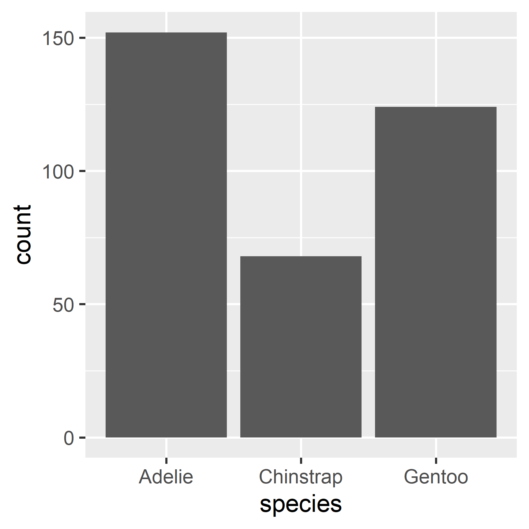
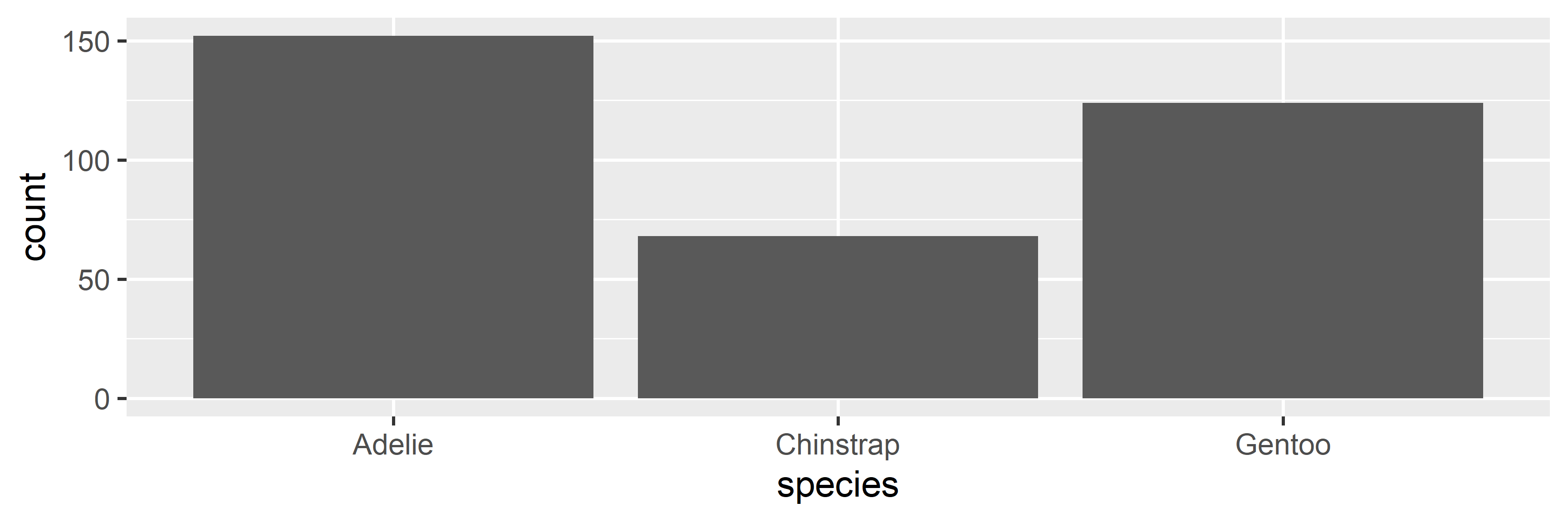
Species Bar Chart

penguins |>                   # start with penguins, pipe to pass tibble
  ggplot(aes(x = species)) +  # map x-axis to species, plus to add to plot
  geom_bar()                  # bar to plot category counts

Species Interpretation

  • Three species were observed
  • Adelie was most common, then Gentoo, then Chinstrap
  • Adelies were observed twice as often as Chinstraps
  • Are unequal frequencies expected? Problematic?

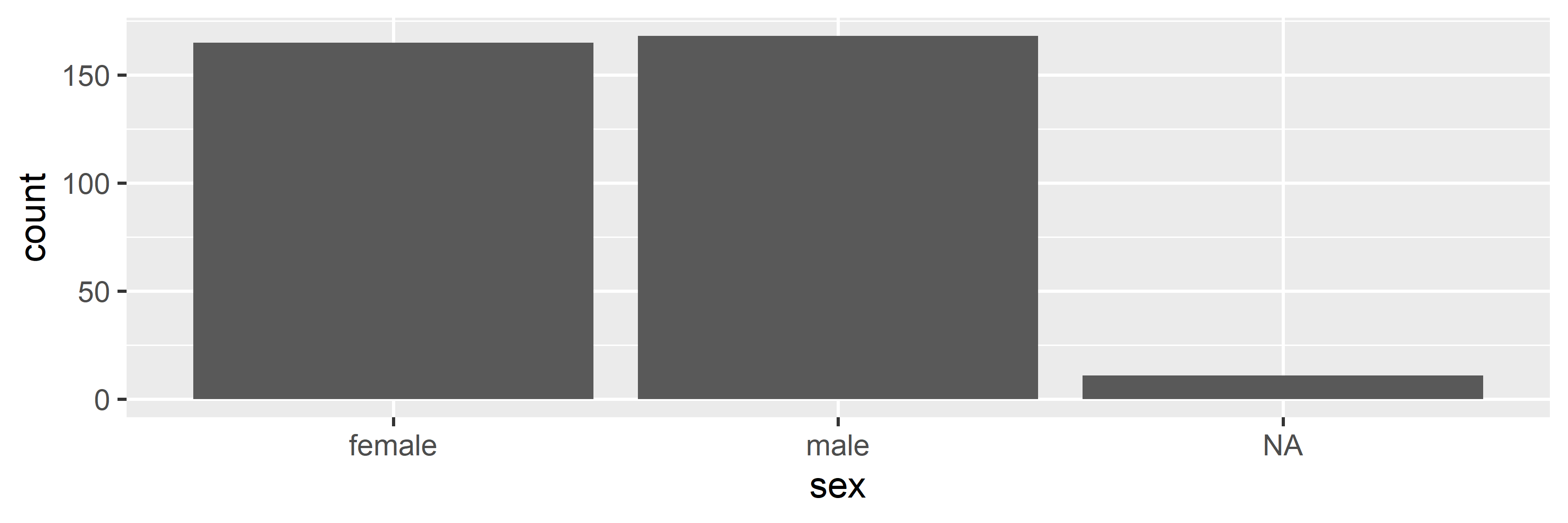
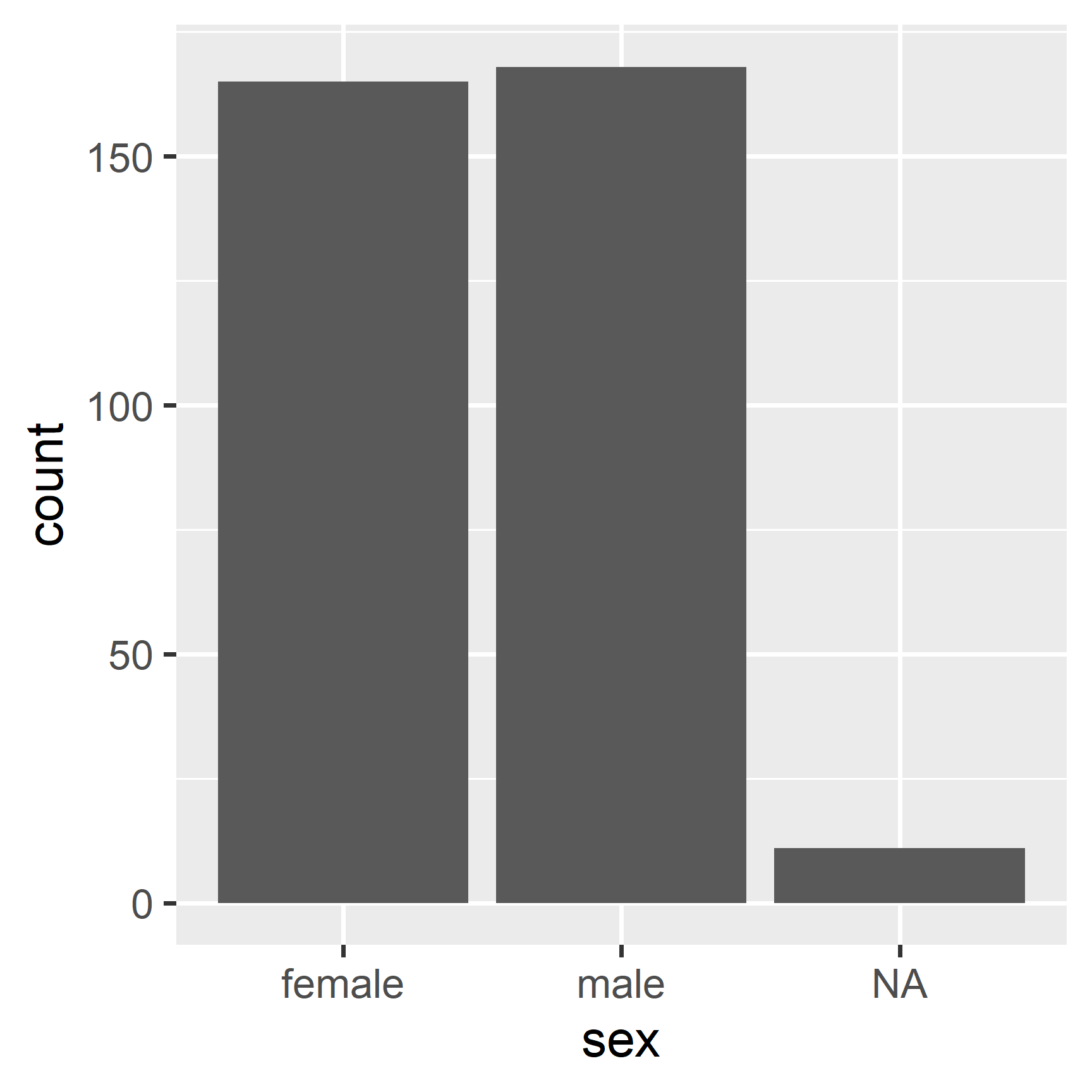
Sex Bar Chart

penguins |>               # start with penguins, pipe to pass tibble
  ggplot(aes(x = sex)) +  # map x-axis to sex, plus to add to plot
  geom_bar()              # bar to plot category counts

Sex Interpretation

  • Males were slightly more common than Females
  • Around 10 observations are missing sex info (NA)
  • Are these NAs: expected? problematic? fixable?

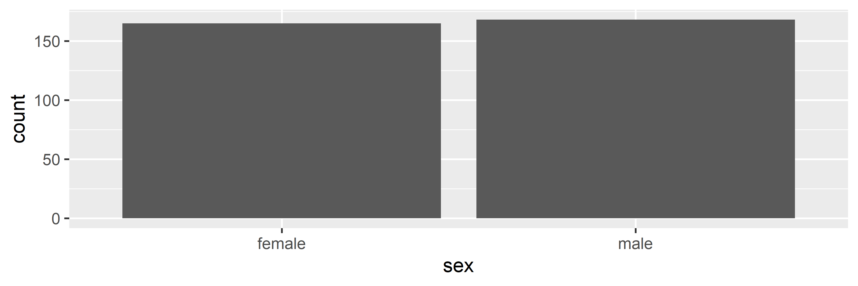
Bar Missing Values

penguins |>               # start with penguins, pipe to pass tibble
  drop_na(sex) |>         # drop NAs in sex, pipe to pass tibble
  ggplot(aes(x = sex)) +  # map x-axis to sex, plus to add to plot
  geom_bar()              # bar to plot category counts

Histogram

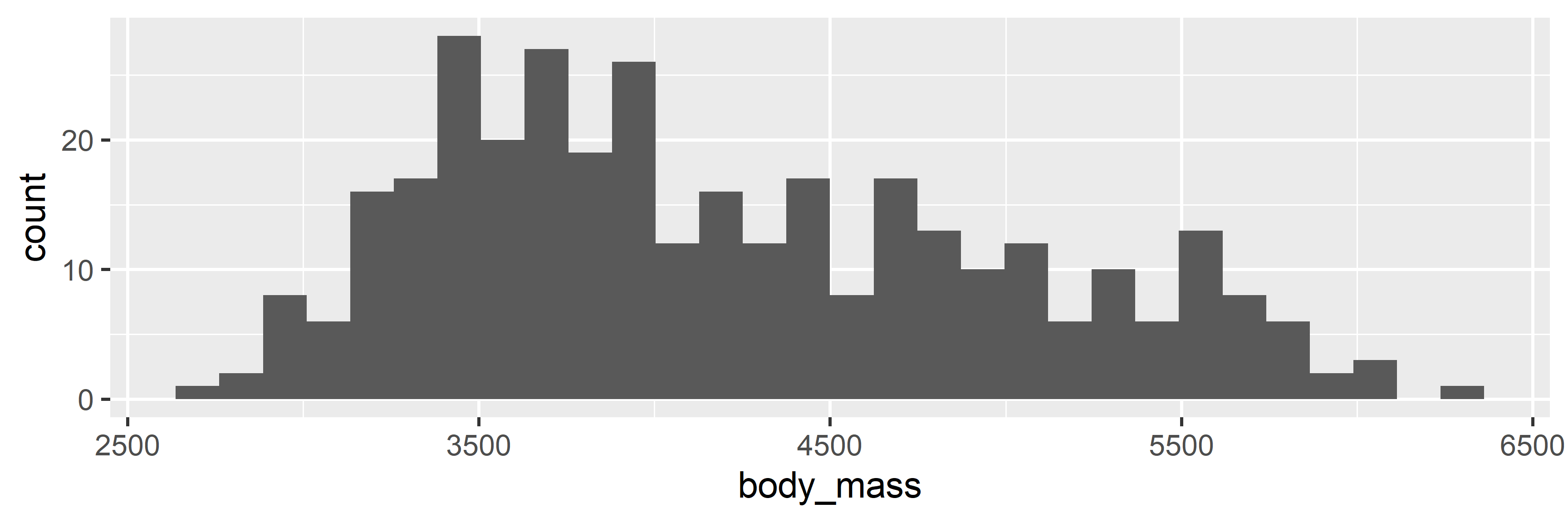
Mass Histogram

penguins |>                     # start with penguins, pipe to pass tibble
  ggplot(aes(x = body_mass)) +  # map x-axis to body_mass, plus to add to plot
  geom_histogram()              # histogram to plot bin counts

Mass Interpretation

  • Body mass ranged from around 2500 to around 6500
  • Most values were between 3250 and 4000
  • Values from 4000 to 5750 were also pretty common
  • At a glance, no values seem impossible or erroneous

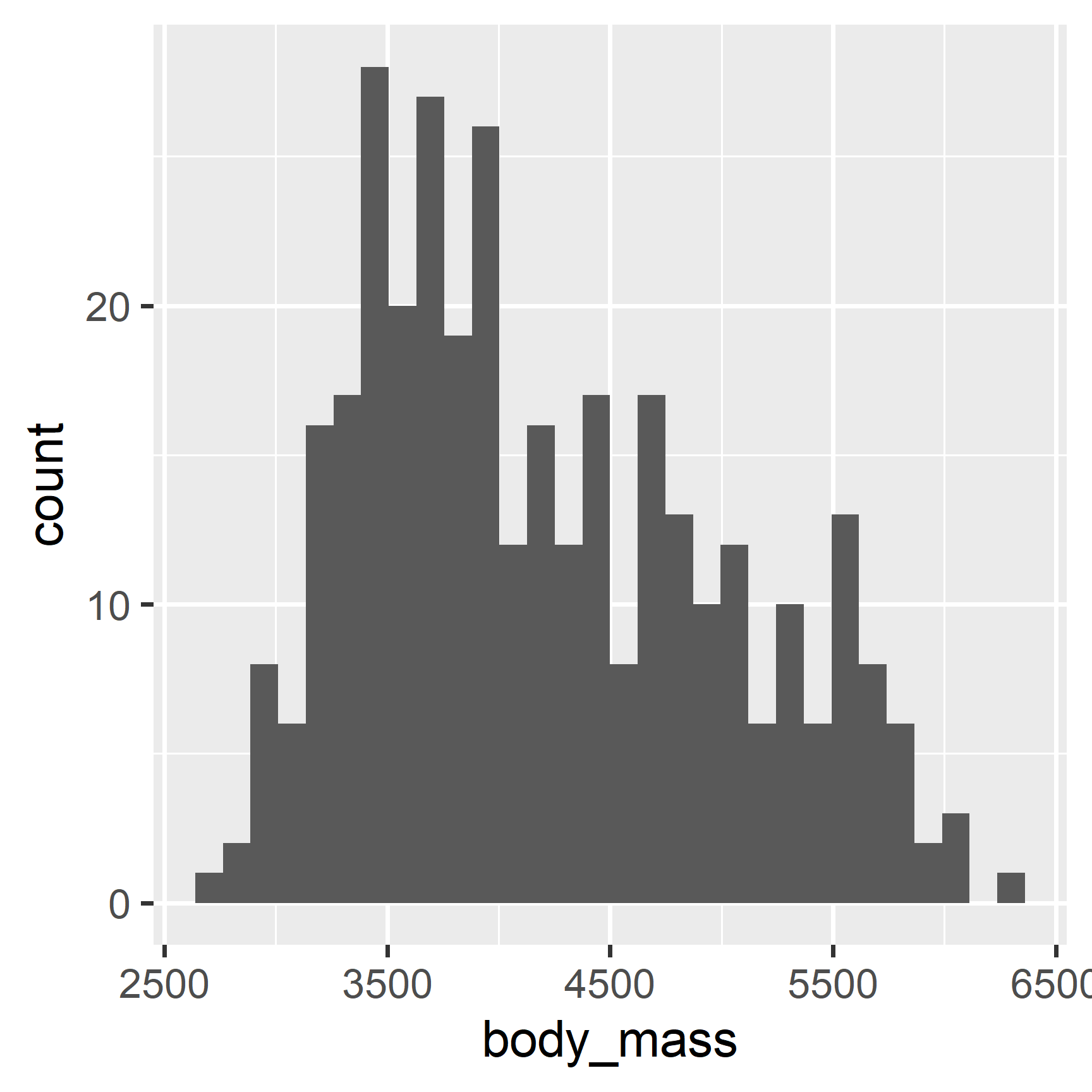
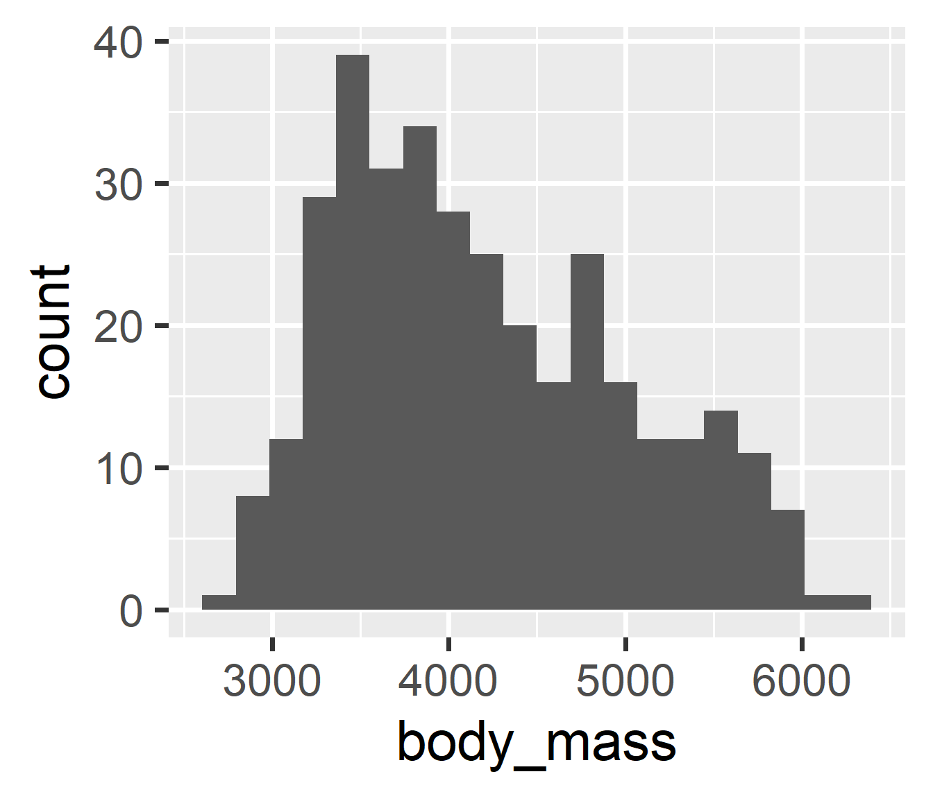
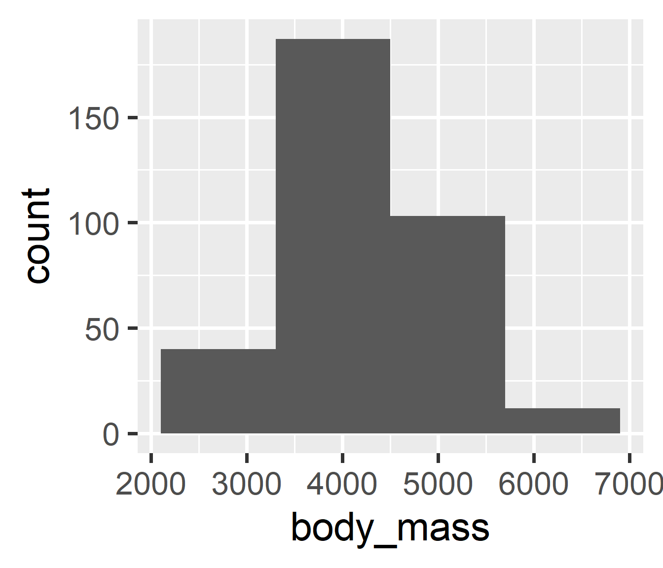
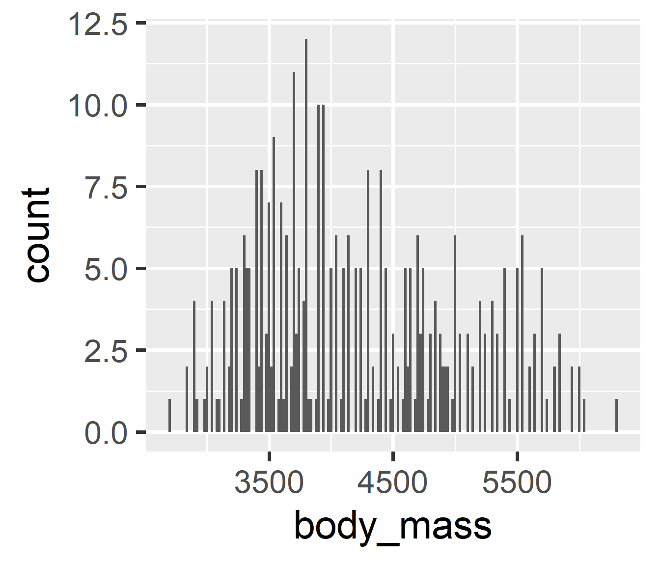
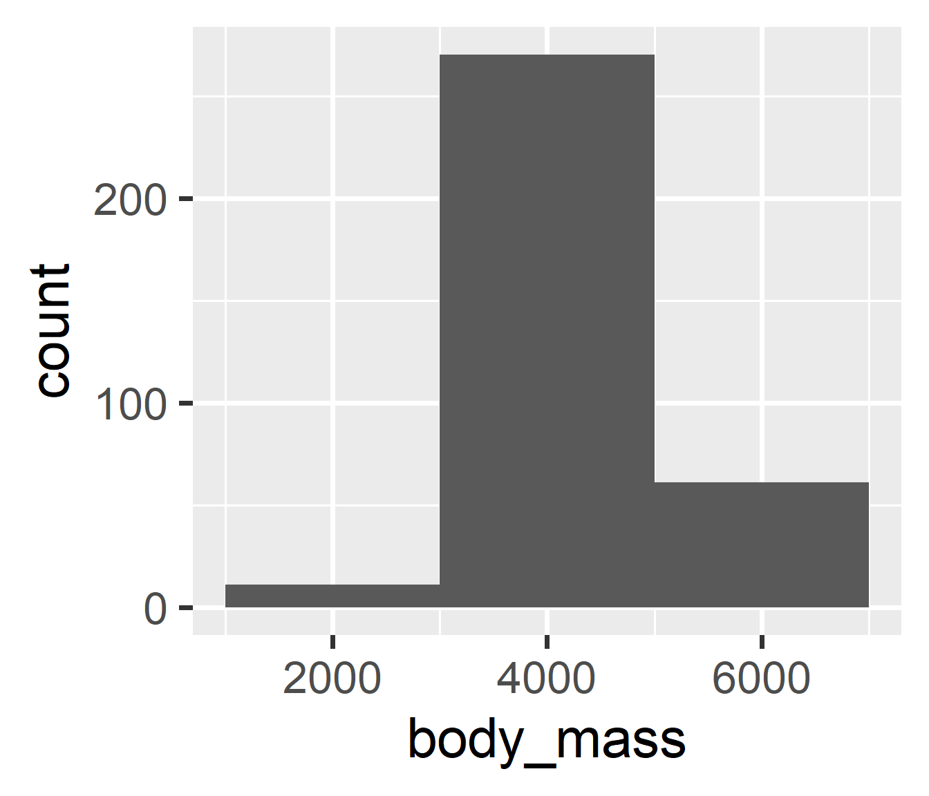
Histogram Bins

# break x range into 20 bins
penguins |>
  ggplot(aes(x = body_mass)) +
  geom_histogram(bins = 20)

# break x range into 4 bins
penguins |>
  ggplot(aes(x = body_mass)) +
  geom_histogram(bins = 4)

Histogram Binwidth

# each bin is 20 x-units wide
penguins |>
  ggplot(aes(x = body_mass)) +
  geom_histogram(binwidth = 20)

# each bin is 2000 x-units wide
penguins |>
  ggplot(aes(x = body_mass)) +
  geom_histogram(binwidth = 2000)

Relationships

Visualizing Relationships

  • We are often interested in variable relationships
    • Does variation in X go with variation in Y?
    • Do higher X scores go with higher Y scores?
    • Do groups differ on Y score distributions?
    • Do certain groups tend to go together?
  • We can extend variation geoms into covariation
    • The geoms we use will heavily depend on…
    • …are the variables continuous or discrete?

Common Strategies

  • Two Continuous \(\rightarrow\) Point
    • Use two positional axes, possibly a smoother
    • x = Variable 1 Values, y = Variable 2 Values
  • One Discrete, One Continuous \(\rightarrow\) Boxplot
    • Use one positional axis and boxes-and-whiskers
    • x = Discrete Categories, y = Continuous Values
  • Two Discrete \(\rightarrow\) Bar (with fill)
    • Use stacked-and-colored bars to show proportions
    • x = Variable 1 Categories, y = Counts, fill = Variable 2 Categories

Scatterplot

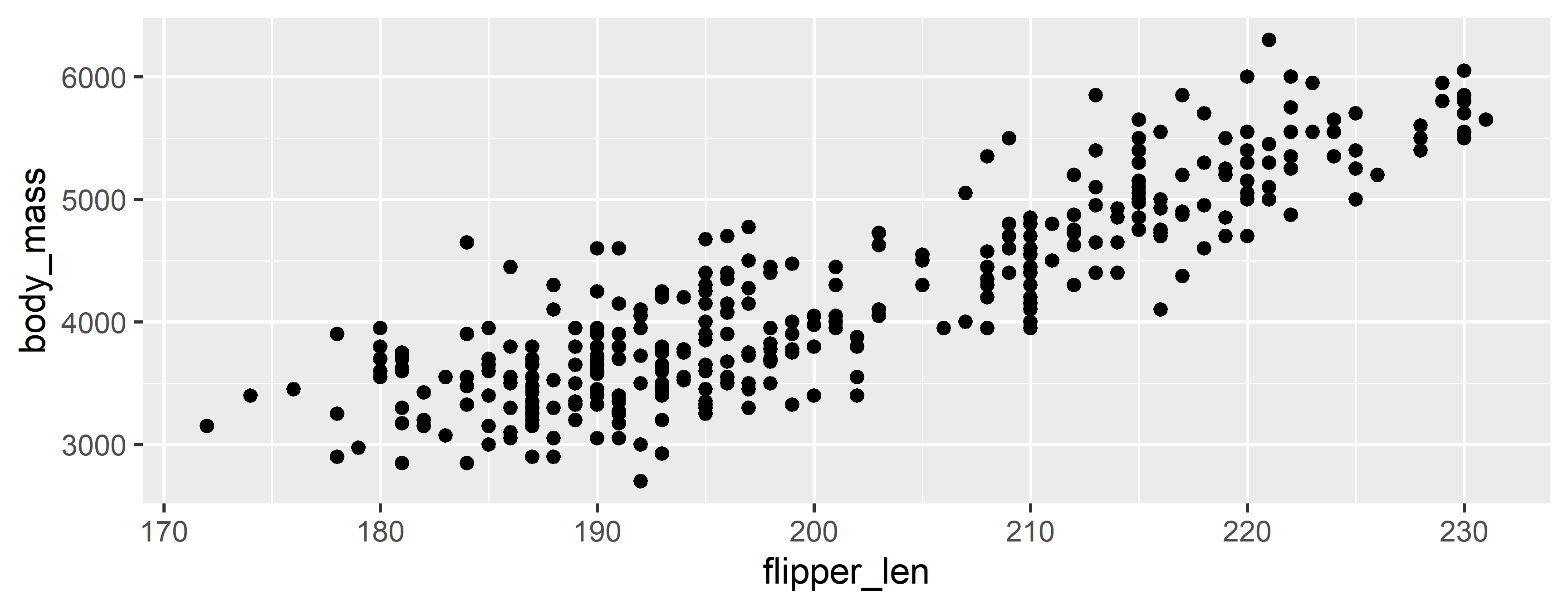
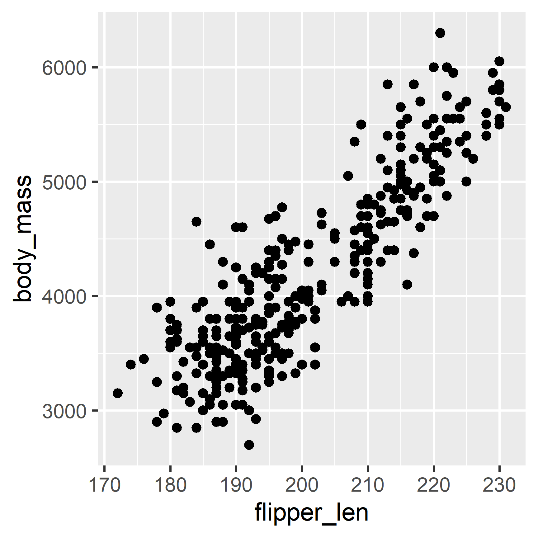
Flipper–Mass Scatterplot

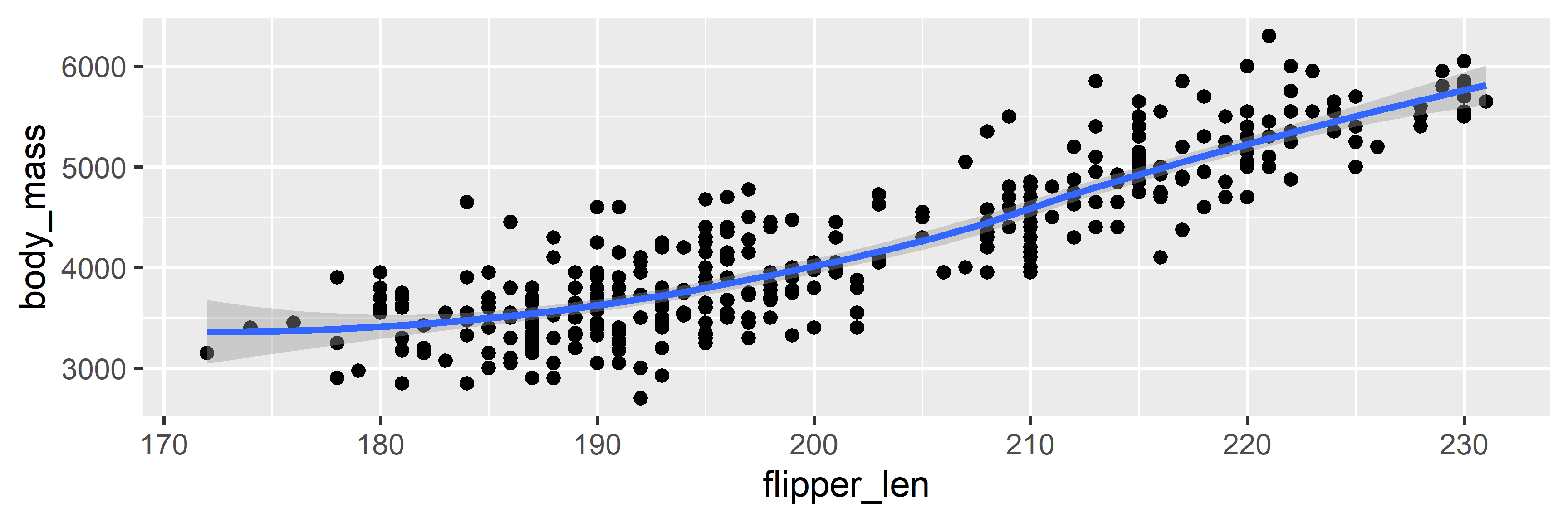
penguins |> ggplot(aes(x = flipper_len, y = body_mass)) + geom_point()

Flipper–Mass Interpretation

  • As flipper length increases, body mass also increases
  • This relationship looks linear (as in a straight line)
  • However, there is some spread around that line
  • There seem to be more penguins with low body mass and low flipper length

Adding a Smooth

penguins |> 
  ggplot(aes(x = flipper_len, y = body_mass)) + 
  geom_point() +
  geom_smooth()

Boxplot

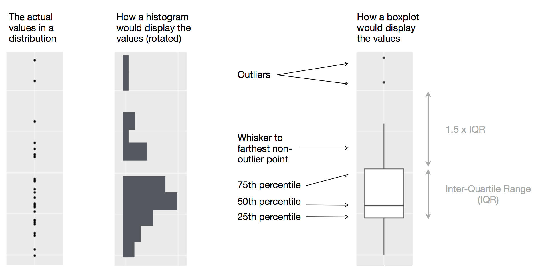
How to read a boxplot

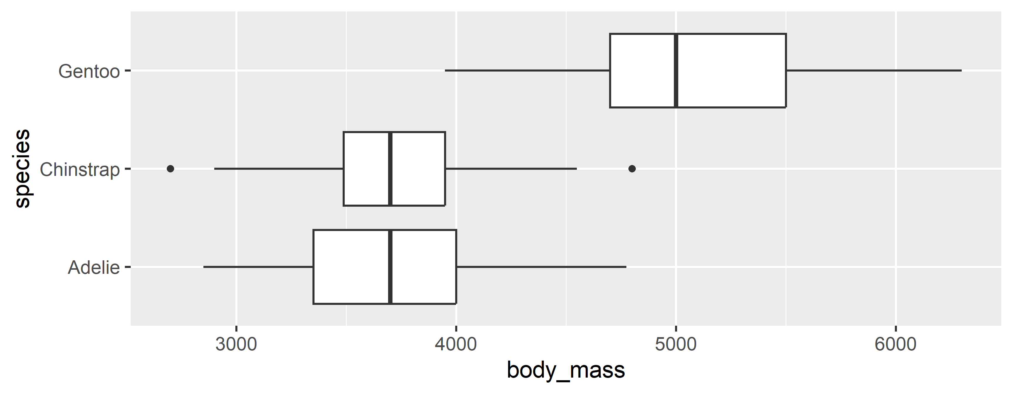
Species–Mass Boxplot

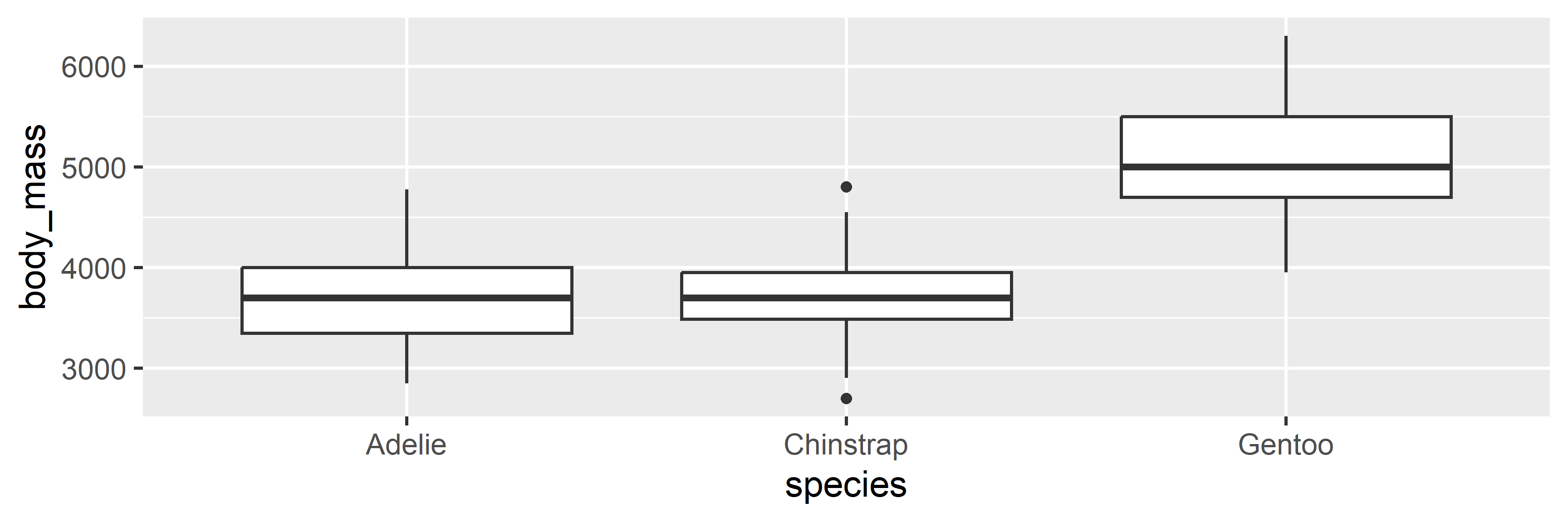
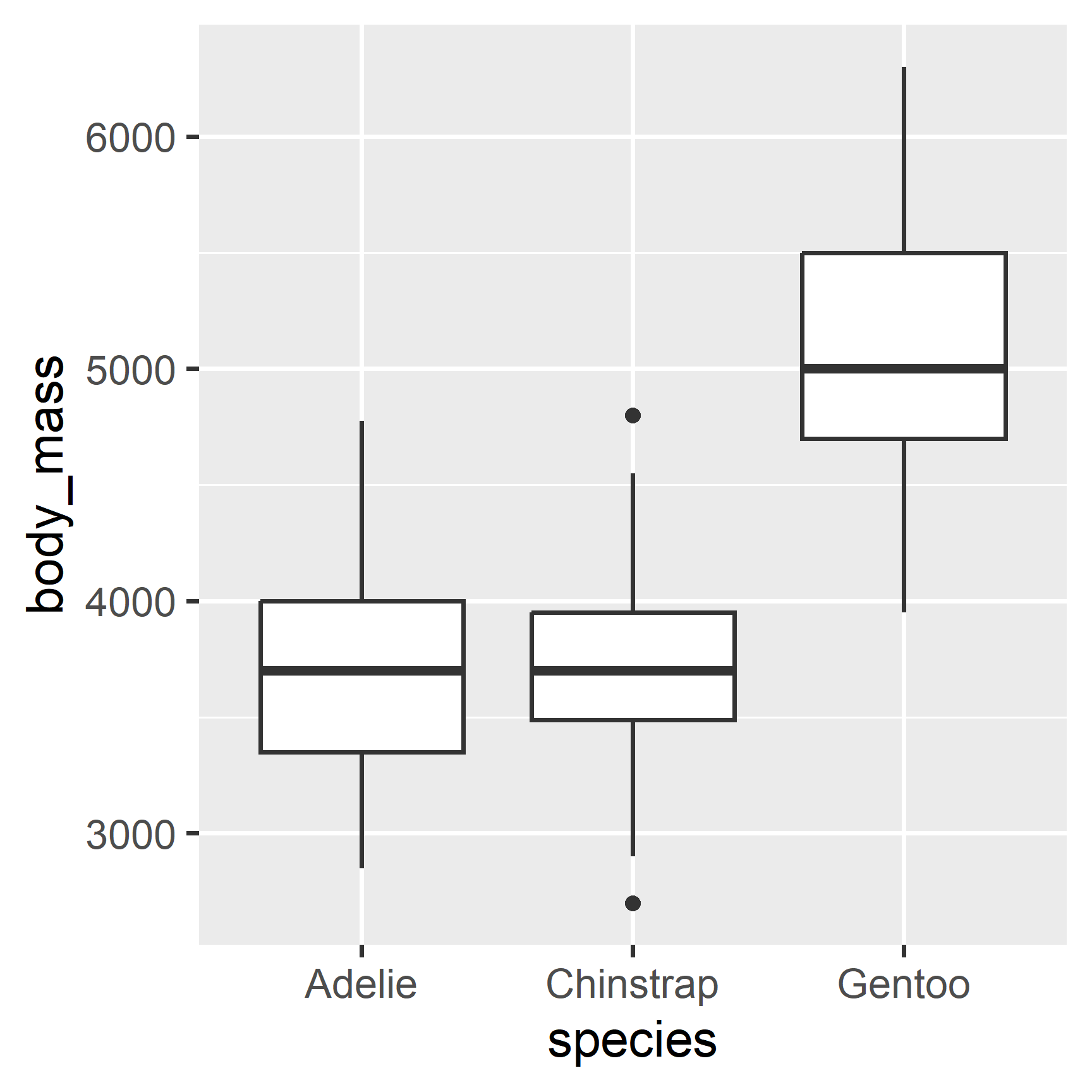
penguins |> ggplot(aes(x = species, y = body_mass)) + geom_boxplot()

Species–Mass Interpretation

  • Adelies and Chinstraps have similar mass distributions
  • There are outlier Chinstraps
  • Gentoos tend to be larger than Adelies & Chinstraps
  • There is overlap: large Adelies & Chinstraps are larger than small Gentoos

Rotated Boxplot

penguins |> ggplot(aes(x = body_mass, y = species)) + geom_boxplot()

Stack Bar Chart

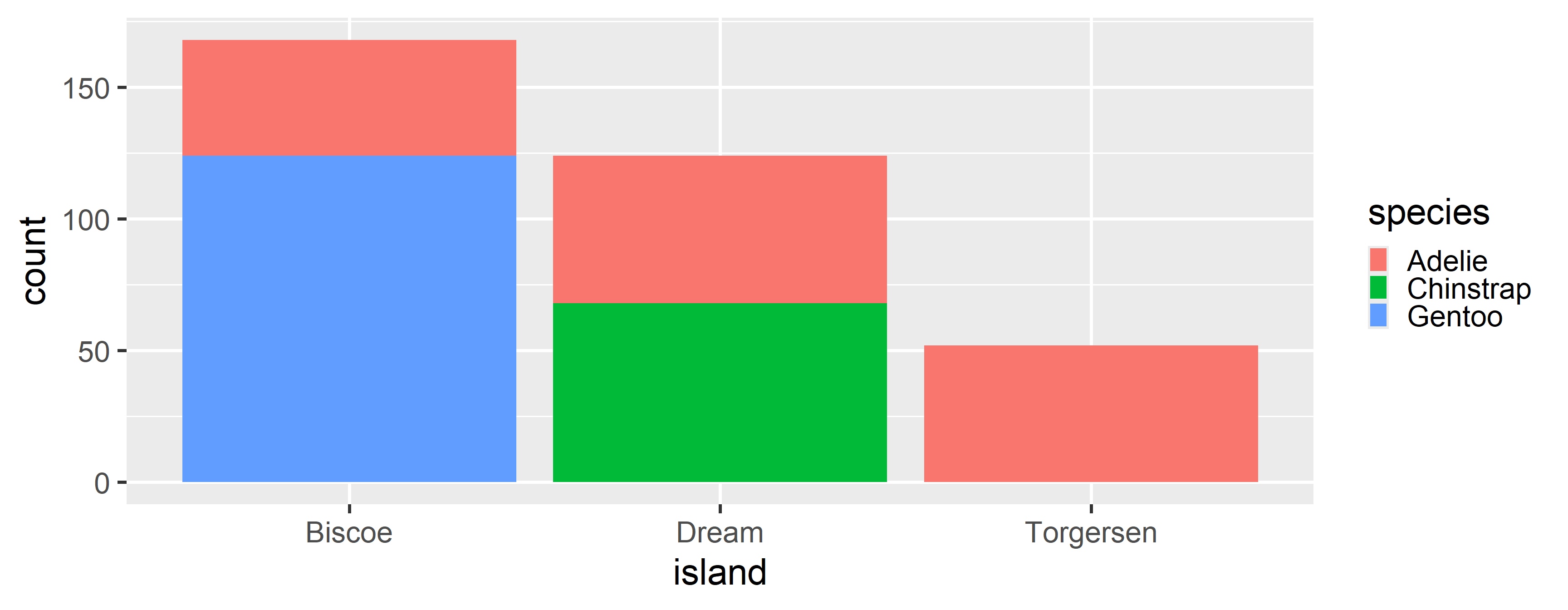
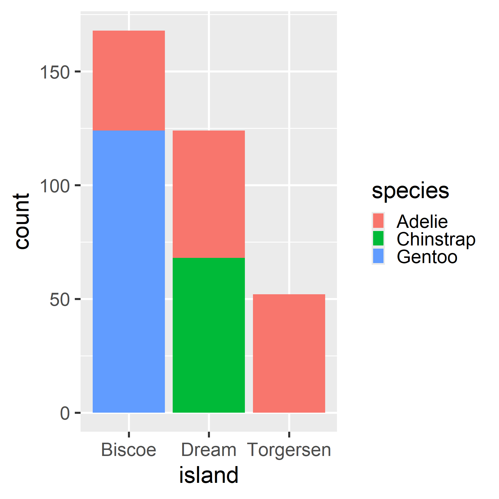
Island–Species Bar Chart

penguins |> ggplot(aes(x = island, fill = species)) + geom_bar()

Island–Species Interpretation

  • Adelies are seen on all three Islands
  • Gentoos are only seen on Biscoe Island
  • Chinstraps are only seen on Dream Island
  • Only Adelies are seen on Torgersen Island

Complex Relationships

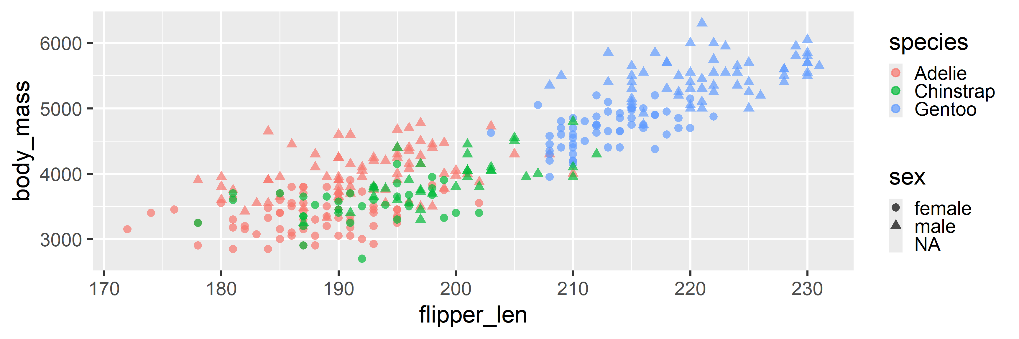
Three or more variables

ggplot(penguins, aes(x = flipper_len, y = body_mass, 
  color = species, shape = sex)) + geom_point(alpha = 0.7)

Mixed Grouping

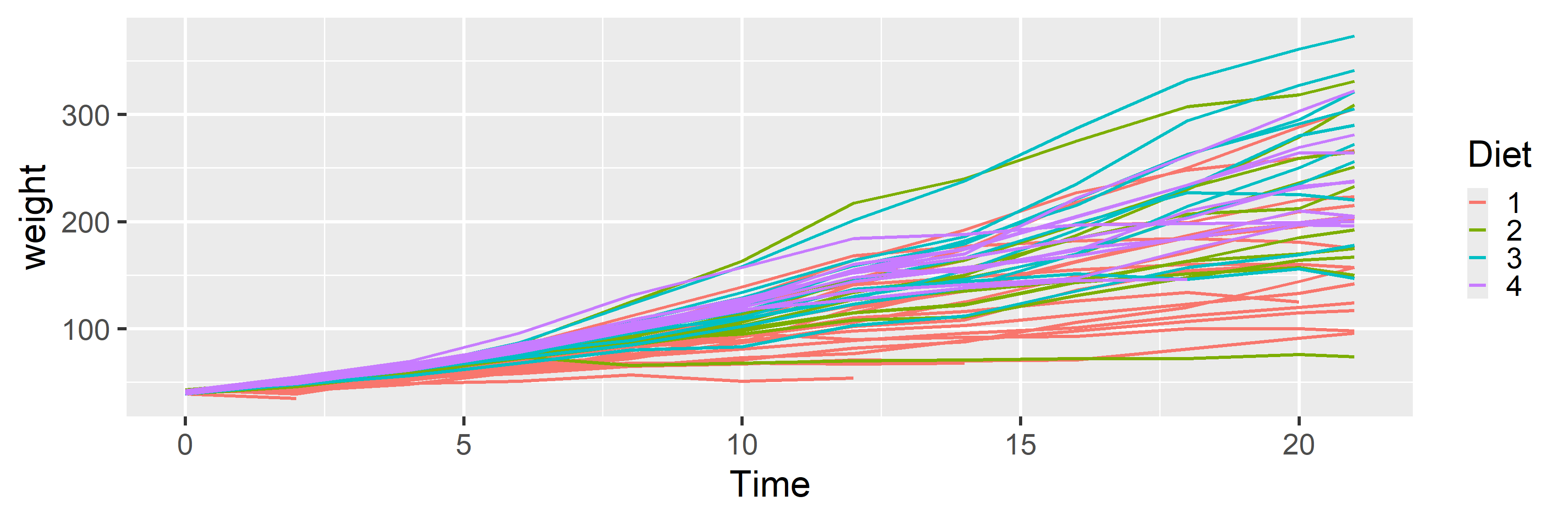
# Group by Chick (one line per Chick) but color by Diet
ggplot(ChickWeight, aes(x = Time, y = weight, group = Chick, color = Diet)) + 
  geom_line()