Foundations of
Data Science

Spring 2026 | Data 2 (399)
Jeffrey M. Girard | Lecture 13b

Roadmap

  • Extract and draw polygon map data in ggplot2

  • Add points and text labels to existing maps

  • Join data with map data and make complex maps

Drawing Maps

Where Do Maps Come From?

  • To draw a map, we need a dataset of geographic coordinates
    • These coordinates define the boundary lines of countries, states, or counties
  • The map_data() function from the {maps} package provides easy access
    • It returns a data frame of longitude and latitude points
  • We will then plot the region shapes using geom_polygon()

Extracting State Data

library(tidyverse)
library(maps)

# Extract the coordinates for the kansas map
kansas <- map_data("county", "kansas") |>
  as_tibble() |> print(n = 5)
# A tibble: 997 × 6
   long   lat group order region subregion
  <dbl> <dbl> <dbl> <int> <chr>  <chr>    
1 -95.1  37.7     1     1 kansas allen    
2 -95.5  37.7     1     2 kansas allen    
3 -95.5  37.7     1     3 kansas allen    
4 -95.5  38.0     1     4 kansas allen    
5 -95.1  38.0     1     5 kansas allen    
# ℹ 992 more rows
Understanding Map Data

  • long and lat: The x and y coordinates of the boundary lines
  • group: A unique identifier for each polygon (e.g., a specific island or continuous landmass)
  • order: The sequence in which the points should be connected to draw the shape correctly
  • region: The name of the geographic area (e.g., state)
  • subregion: The name of the area portion (e.g., county)

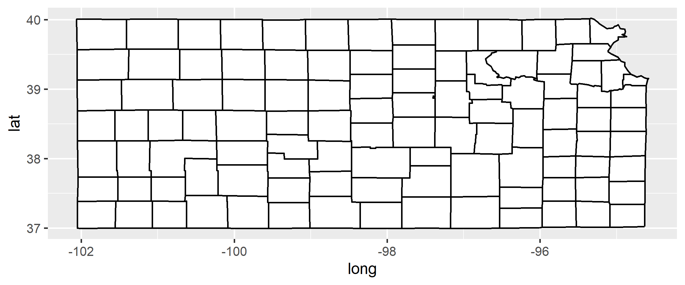
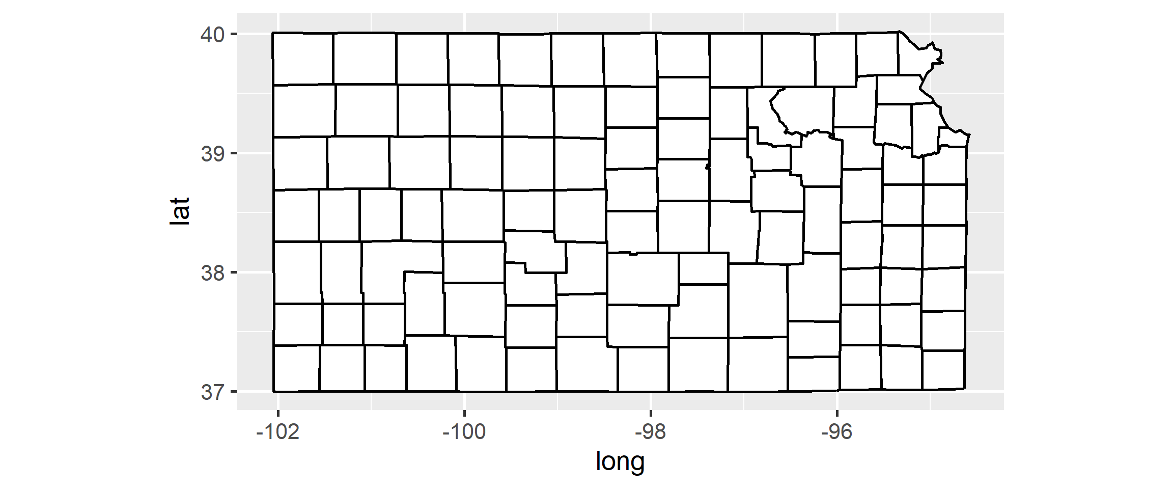
Drawing Polygons

ggplot(kansas, aes(x = long, y = lat, group = group)) +
  geom_polygon(fill = "white", color = "black")

Fixing the Distortion

ggplot(kansas, aes(x = long, y = lat, group = group)) +
  geom_polygon(fill = "white", color = "black") + coord_quickmap()

Wrangling Map Data

Pulling All States

# Extract the coordinates for all US states
state_map <- map_data("state") |> 
  as_tibble() |> print(n = 10)
# A tibble: 15,537 × 6
    long   lat group order region  subregion
   <dbl> <dbl> <dbl> <int> <chr>   <chr>    
 1 -87.5  30.4     1     1 alabama <NA>     
 2 -87.5  30.4     1     2 alabama <NA>     
 3 -87.5  30.4     1     3 alabama <NA>     
 4 -87.5  30.3     1     4 alabama <NA>     
 5 -87.6  30.3     1     5 alabama <NA>     
 6 -87.6  30.3     1     6 alabama <NA>     
 7 -87.6  30.3     1     7 alabama <NA>     
 8 -87.6  30.3     1     8 alabama <NA>     
 9 -87.7  30.3     1     9 alabama <NA>     
10 -87.8  30.3     1    10 alabama <NA>     
# ℹ 15,527 more rows

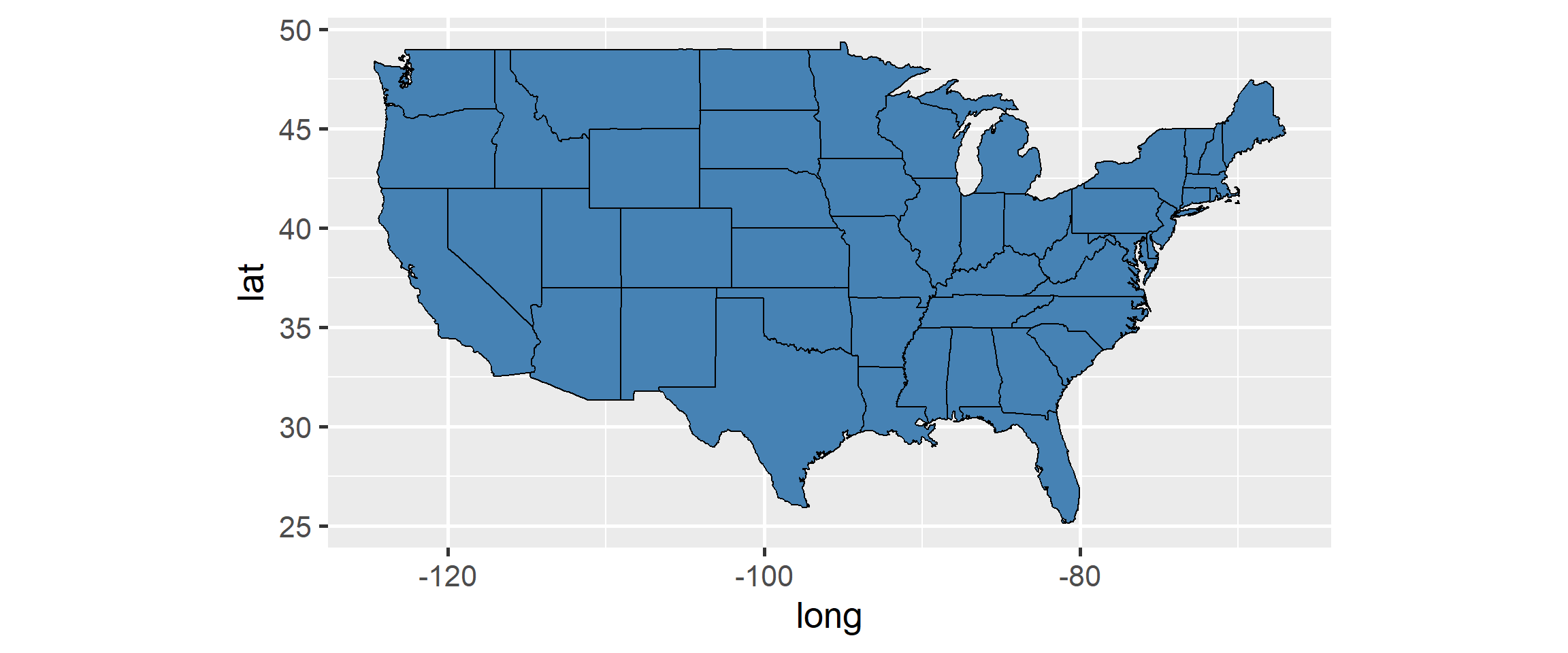
Drawing the US Map

ggplot(state_map, aes(x = long, y = lat, group = group)) +
  geom_polygon(fill = "steelblue", color = "black", linewidth = 0.5) +
  coord_quickmap()

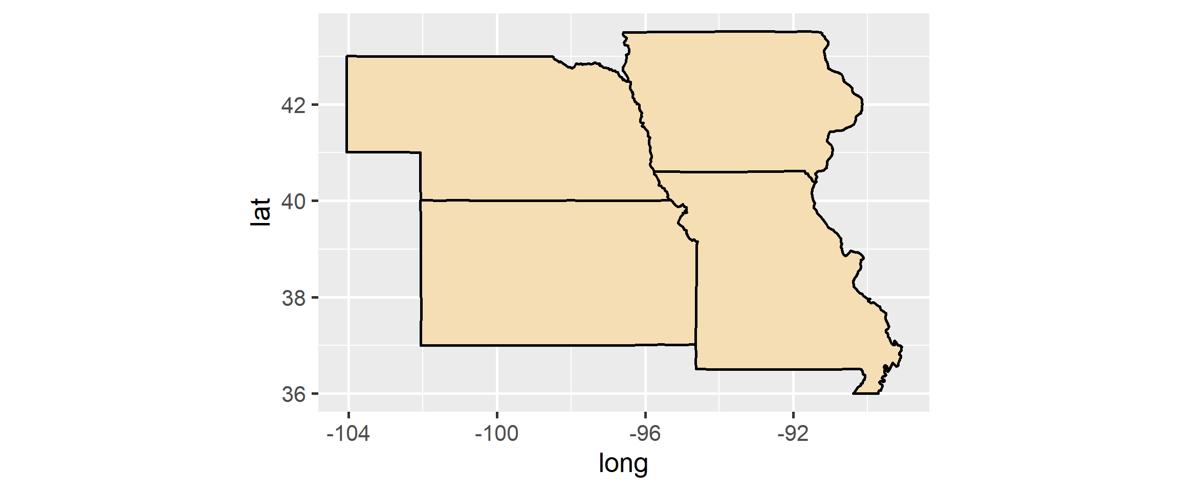
Filtering Regions

# We can use standard dplyr tools to map specific regions
midwest_map <- state_map |> 
  filter(region %in% c("kansas", "missouri", "iowa", "nebraska"))

ggplot(midwest_map, aes(x = long, y = lat, group = group)) +
  geom_polygon(fill = "wheat", color = "black") +
  coord_quickmap()

Points and Labels

Overlaying Data

  • Maps are most useful when they provide context for other data
  • Because maps in ggplot2 are just standard geoms, we can easily layer other geoms on top of them
    • geom_point() is great for cities, events, or locations
    • geom_text() or geom_label() can identify specific places

A City Dataset

# Let's create a small dataset of cities
cities <- tribble(
  ~city, ~long, ~lat,
  "Lawrence", -95.2353, 38.9717,
  "St. Louis", -90.1994, 38.6270,
  "Des Moines", -93.6091, 41.5868,
  "Omaha", -95.9345, 41.2565
)
cities
# A tibble: 4 × 3
  city        long   lat
  <chr>      <dbl> <dbl>
1 Lawrence   -95.2  39.0
2 St. Louis  -90.2  38.6
3 Des Moines -93.6  41.6
4 Omaha      -95.9  41.3

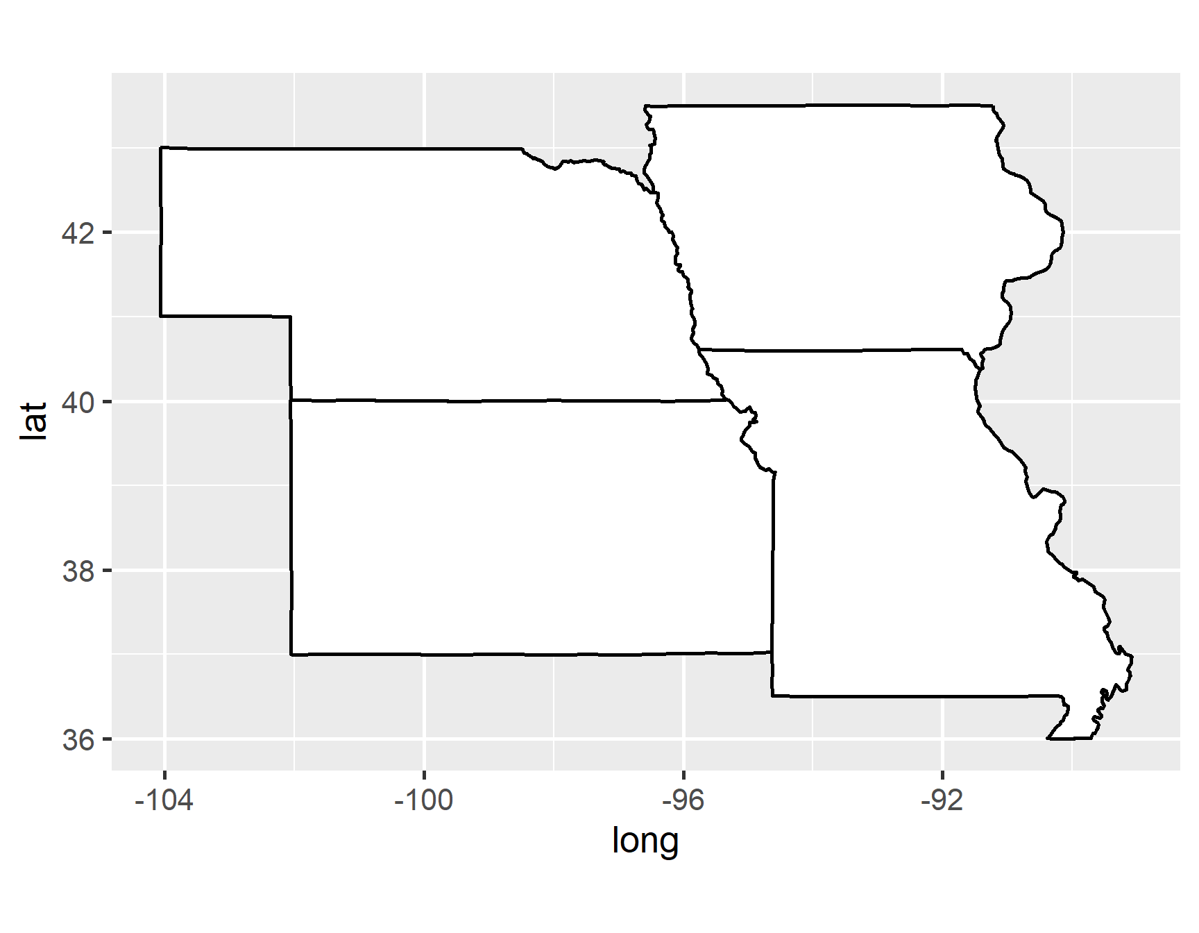
Separating Aesthetics

p_midwest <- 
  ggplot() +
  geom_polygon(
    data = midwest_map, 
    mapping = aes(
      x = long, 
      y = lat, 
      group = group
    ),
    fill = "white", 
    color = "black"
  ) +
  coord_quickmap()
p_midwest

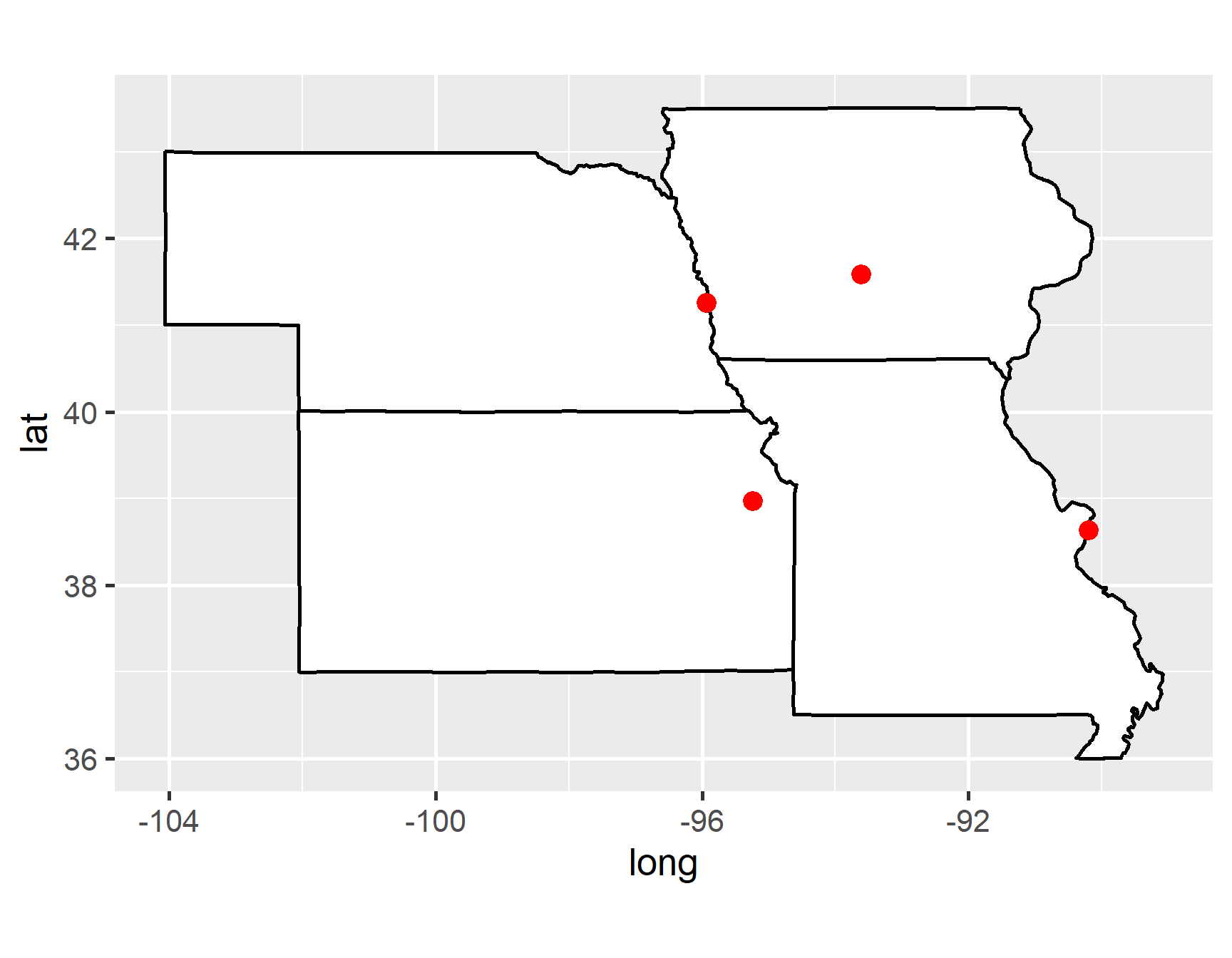
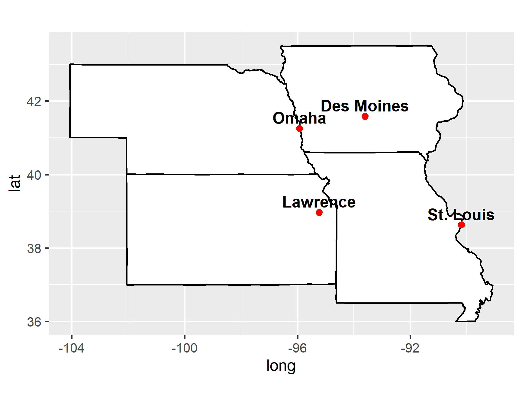
Adding Points

p_midwest +
  geom_point(
    data = cities,
    aes(x = long, y = lat),
    color = "red", 
    size = 4
  )

Adding Labels

p_midwest +
  geom_point(
    data = cities,
    aes(x = long, y = lat),
    color = "red", 
    size = 3
  ) +
  geom_text(
    data = cities,
    aes(
      x = long, 
      y = lat, 
      label = city
    ),
    nudge_y = 0.3, # shift up
    fontface = "bold"
  )

Choropleth Maps

What is a Choropleth?

  • A choropleth map uses color or shading to represent statistical data across geographic regions
    • For example, coloring states based on their population density or average temperature
  • To create one, we must merge our geographic polygon data with our statistical data using a join

Preparing Statistical Data

arrests <- read_csv("arrests.csv")
arrests
# A tibble: 50 × 5
  region     Murder Assault UrbanPop  Rape
  <chr>       <dbl>   <dbl>    <dbl> <dbl>
1 alabama      13.2     236       58  21.2
2 alaska       10       263       48  44.5
3 arizona       8.1     294       80  31  
4 arkansas      8.8     190       50  19.5
5 california    9       276       91  40.6
6 colorado      7.9     204       78  38.7
# ℹ 44 more rows

Joining the Data

# We use left_join() to attach the statistics to the map boundaries
state_joined <- 
  state_map |> 
  left_join(arrests, by = "region")

state_joined
# A tibble: 15,537 × 10
   long   lat group order region  subregion Murder Assault UrbanPop  Rape
  <dbl> <dbl> <dbl> <int> <chr>   <chr>      <dbl>   <dbl>    <dbl> <dbl>
1 -87.5  30.4     1     1 alabama <NA>        13.2     236       58  21.2
2 -87.5  30.4     1     2 alabama <NA>        13.2     236       58  21.2
3 -87.5  30.4     1     3 alabama <NA>        13.2     236       58  21.2
4 -87.5  30.3     1     4 alabama <NA>        13.2     236       58  21.2
5 -87.6  30.3     1     5 alabama <NA>        13.2     236       58  21.2
6 -87.6  30.3     1     6 alabama <NA>        13.2     236       58  21.2
# ℹ 15,531 more rows

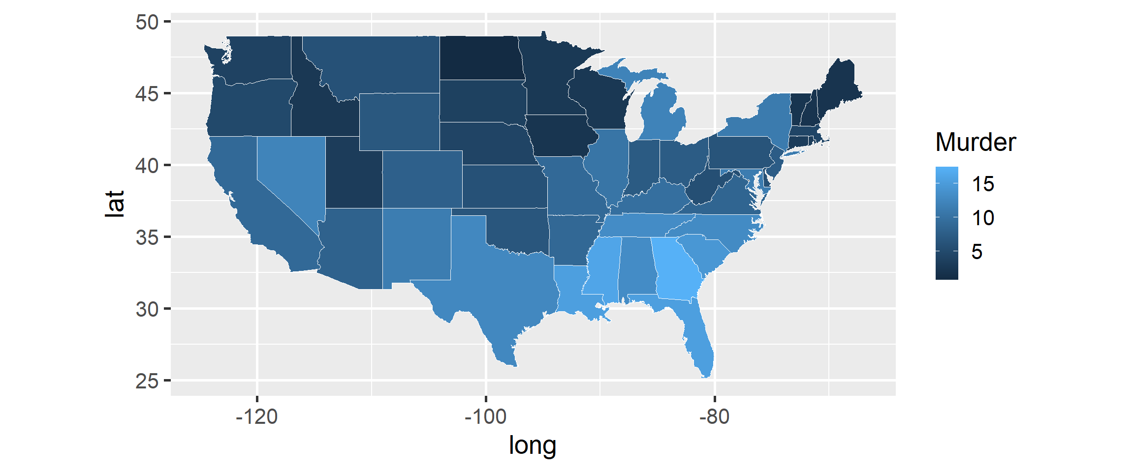
Creating the Choropleth

# We map the fill aesthetic to one of our statistical variables
ggplot(state_joined, aes(x = long, y = lat, group = group)) +
  geom_polygon(aes(fill = Murder), color = "white", linewidth = 0.3) +
  coord_quickmap()

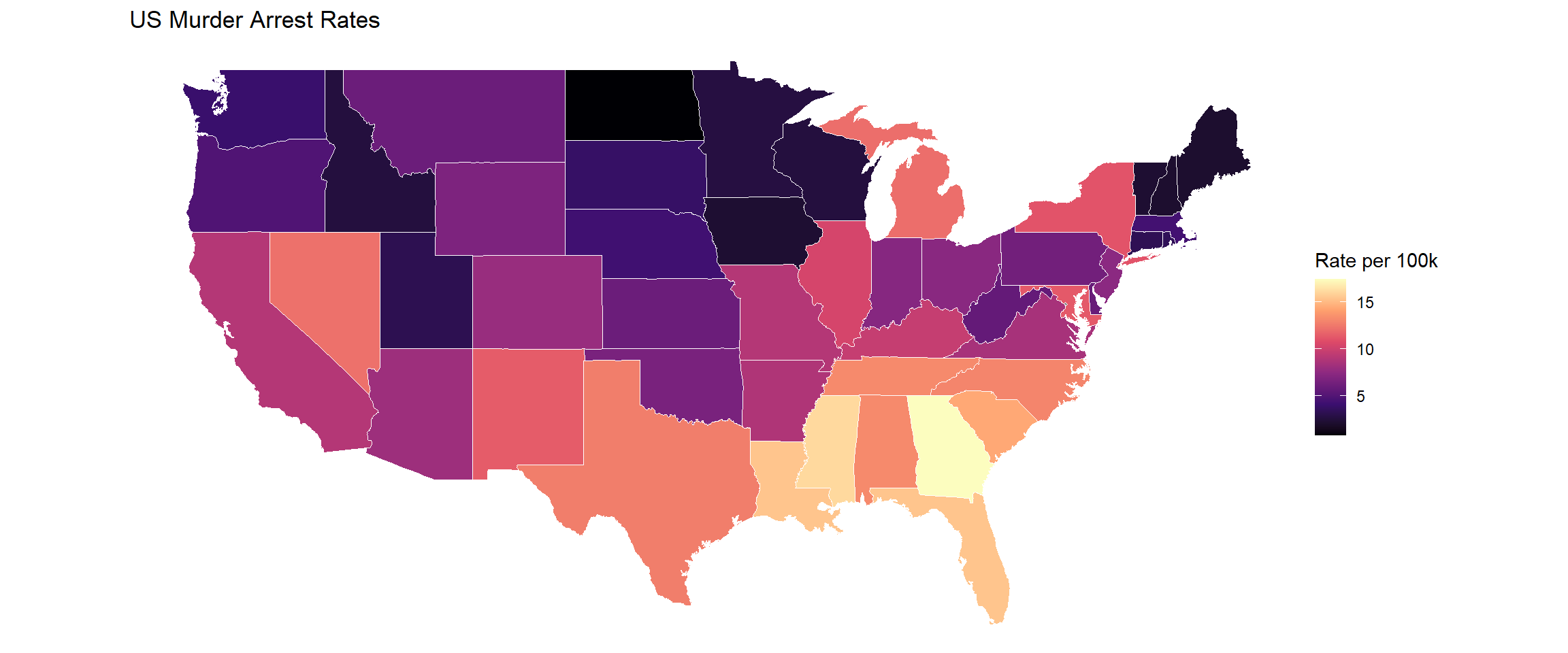
Polishing the Map

ggplot(
  state_joined, 
  aes(x = long, y = lat, group = group)
) +
  geom_polygon(
    aes(fill = Murder), 
    color = "white",
    linewidth = 0.3
  ) +
  coord_quickmap() +
  scale_fill_viridis_c(option = "magma") + # use better colors
  theme_void() + # remove the axes and gridlines
  labs(
    title = "US Murder Arrest Rates",
    fill = "Rate per 100k"
  )

Polishing the Map

Summary

  • Coordinates: Alter how space is mapped using coord_fixed(), coord_polar(), and coord_quickmap()
  • Polygons: Build basic maps using map_data() and geom_polygon(), ensuring group is mapped properly
  • Layers: Add context to maps by layering geom_point() and geom_text() from separate data sources
  • Choropleths: Color geographic regions by joining statistical data to spatial boundary data