*Note that you can click the three-line (hamburger) icon on the bottom-left of the slides to access a navigation menu. You can click inside the slides region and press the left and right arrow keys on your keyboard to advance and reverse the slides and animations.
Practice
1) Scatterplots
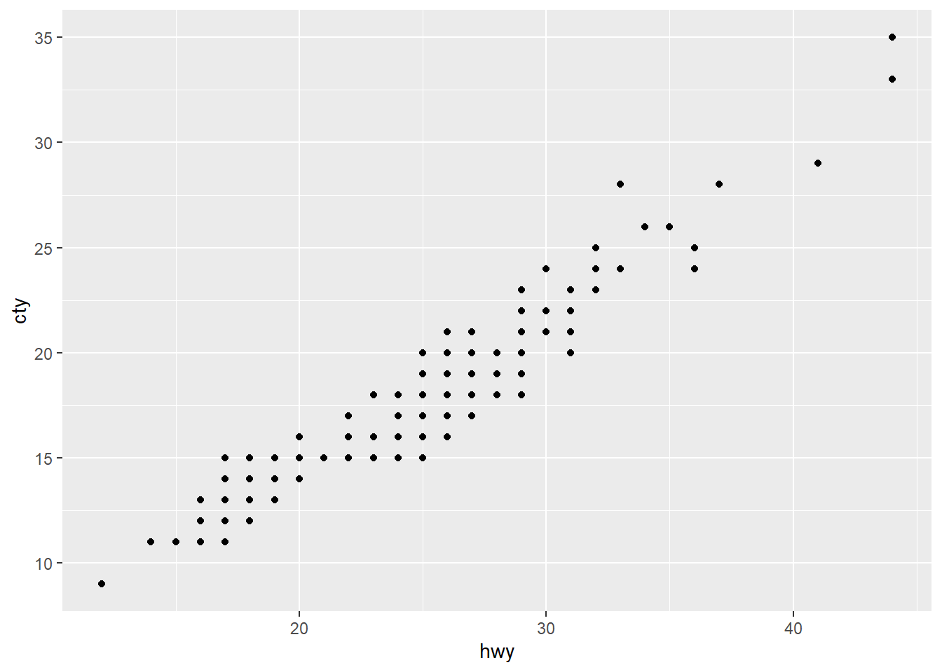
Create a new scatterplot using the mpg dataset (from the {ggplot2} package).
Map Highway MPG (hwy) to the x-axis.
Map City MPG (cty) to the y-axis.
Ensure the points are displayed as geometric objects.
Save the plot from question 1 as a PNG file named “plot_mpg.png” with a width of 8 inches and a height of 6 inches.
Save the plot from question 1 as a PDF file named “plot_mpg.pdf” with the same dimensions.
Open both files on your computer. Zoom in closely on the points in both files and describe the difference in quality between the raster (PNG) and vector (PDF) versions.
*Note that you can click the three-line (hamburger) icon on the bottom-left of the slides to access a navigation menu. You can click inside the slides region and press the left and right arrow keys on your keyboard to advance and reverse the slides and animations.
Practice
1) Layers and Settings
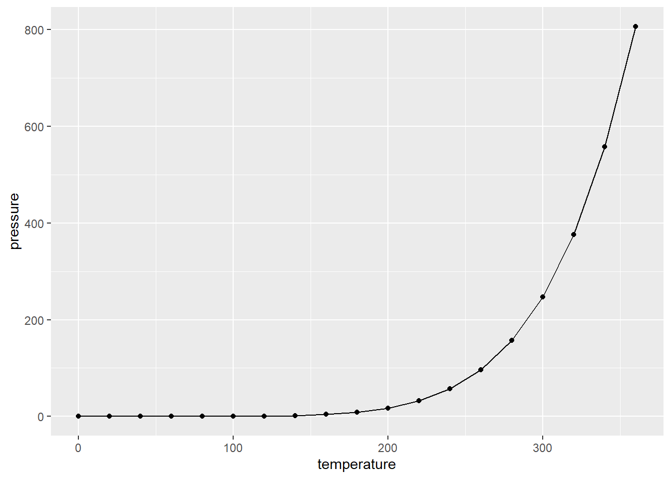
Layering Geoms: The pressure dataset (from the “datasets” package) contains data on the relationship between temperature and vapor pressure of mercury. Create a plot to visualize this.
Map Temperature (temperature) to the x-axis and Pressure (pressure) to the y-axis.
Add a layer of points using geom_point().
Add a layer of lines using geom_line().
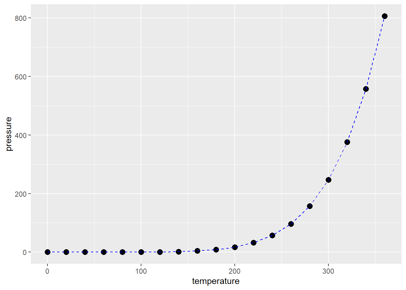
Setting Aesthetics: Modify the plot from Part (a) to change the static appearance.
Keep the points layer, but set the size of the points to 3.
Modify the line layer: set the color to “blue” and the linetype to “dashed”.
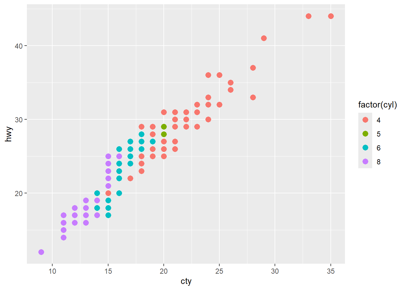
Mapping Aesthetics: Create a scatterplot using the mpg dataset (from the “ggplot2” package) to see if fuel efficiency data is clustered by cylinder count.
Map City MPG (cty) to the x-axis and Highway MPG (hwy) to the y-axis.
Map Cylinders (cyl) to the color aesthetic. (Note: You may want to wrap cyl in factor() so R treats it as categories rather than a continuous number).
Add a layer of points and set their size to 3.
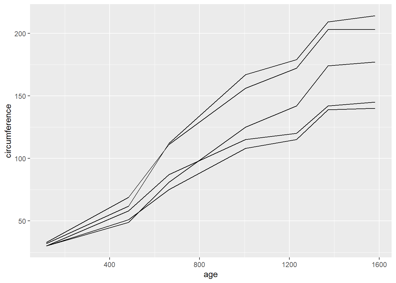
Explicit Grouping: The Orange dataset (from the “datasets” package) tracks the growth of 5 specific orange trees. Create a line plot to visualize this growth.
Map Age (age) to the x-axis and Circumference (circumference) to the y-axis.
Map Tree (Tree) to the group aesthetic.
Add a layer of lines using geom_line().
Bonus: What happens if you remove the group aesthetic?
Answer key
Part (a)
data("mpg", package ="ggplot2")mpg |>ggplot(aes(x = cty, y = hwy, color =factor(cyl))) +geom_point(size =3)
Part (b)
data("Orange", package ="datasets")Orange |>ggplot(aes(x = age, y = circumference, group = Tree)) +geom_line()
*Note that you can click the three-line (hamburger) icon on the bottom-left of the slides to access a navigation menu. You can click inside the slides region and press the left and right arrow keys on your keyboard to advance and reverse the slides and animations.
Practice
1) Distributions
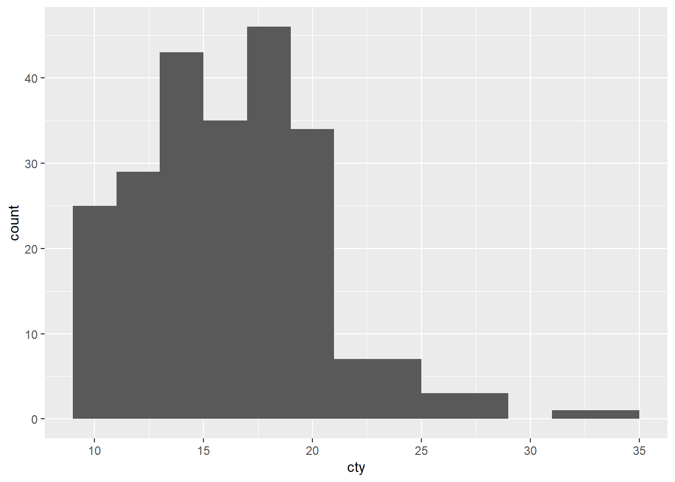
Create a histogram using the mpg dataset (from the {ggplot2} package) to visualize the distribution of City MPG.
Map City MPG (cty) to the x-axis.
Ensure the bars are displayed as geometric objects using geom_histogram().
Set the binwidth argument to 2.
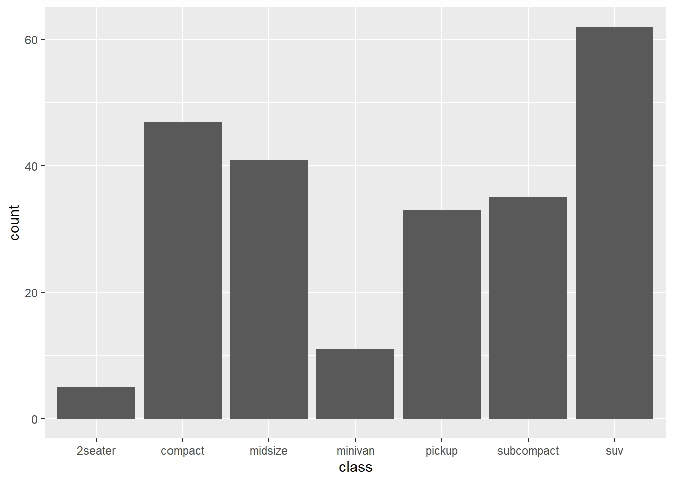
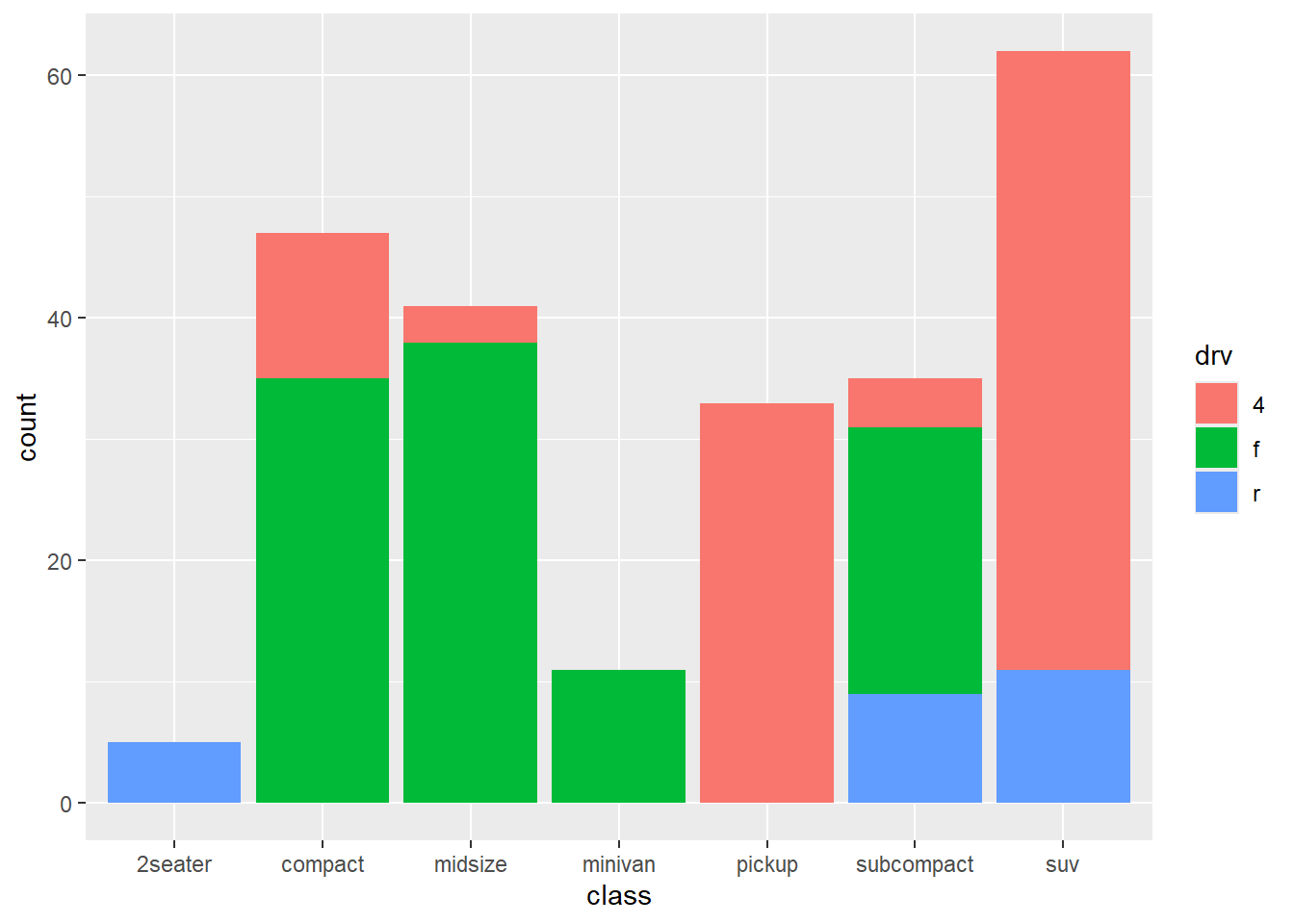
Create a bar chart using the mpg dataset to visualize the distribution of Vehicle Class.
Map Vehicle Class (class) to the x-axis.
Ensure the bars are displayed as geometric objects using geom_bar().