*Note that you can click the three-line (hamburger) icon on the bottom-left of the slides to access a navigation menu. You can click inside the slides region and press the left and right arrow keys on your keyboard to advance and reverse the slides and animations.
Practice
1) Faceting Sleep Patterns
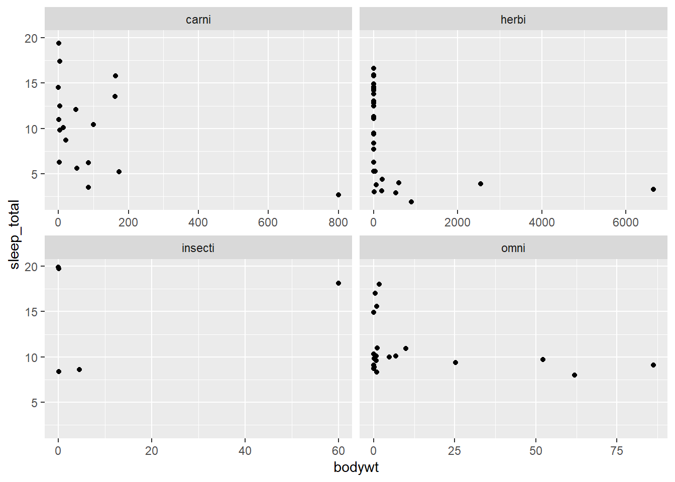
Using the msleep dataset (from {ggplot2}), let’s explore how different types of “vores” (carnivores, herbivores, etc.) sleep.
Create a scatterplot with bodywt on the x-axis and sleep_total on the y-axis.
Use facet_wrap() to create subplots based on the vore column.
Because mammals have very different weight ranges, set scales = "free_x" within the facet function so each subplot has its own x-axis scale.
Answer key
library(tidyverse)data("msleep", package ="ggplot2")# We drop NAs in vore to keep the facets cleanmsleep |>drop_na(vore) |>ggplot(aes(x = bodywt, y = sleep_total)) +geom_point() +facet_wrap(facets =vars(vore), scales ="free_x")
2) Comparing Metro Areas Across States
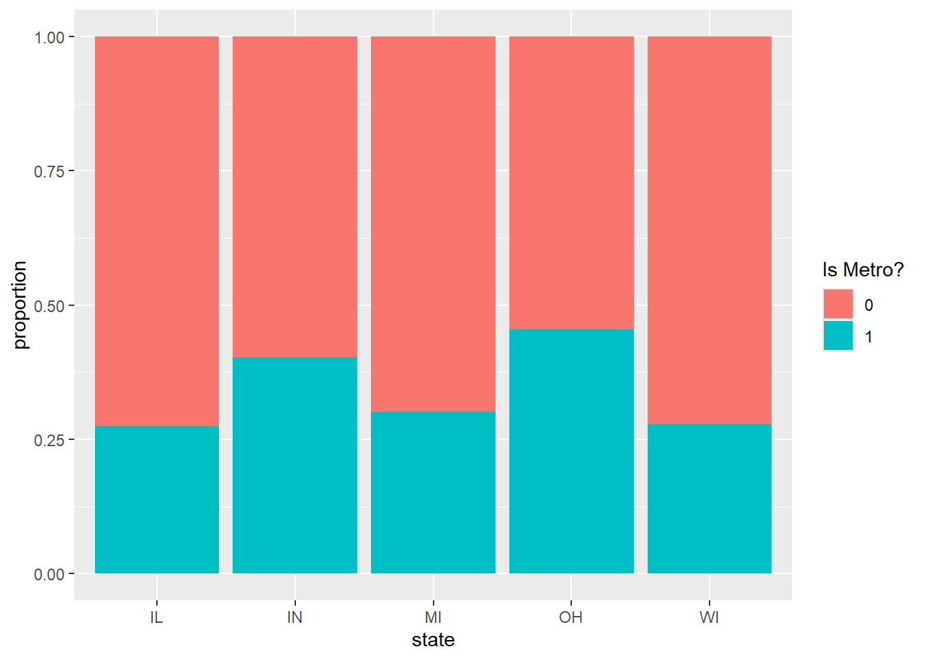
Let’s use the midwest dataset (from {ggplot2}) to see the distribution of counties that are considered “metropolitan” across different states.
Create a bar chart (geom_bar) with state on the x-axis.
Map the fill aesthetic to inmetro (using factor() to treat it as categorical).
Use position = "fill" to show the proportion (rather than the count) of metro vs. non-metro counties in each state.
Update the y label to “proportion” and the fill label to “Is Metro?”
Answer key
data("midwest", package ="ggplot2")ggplot(midwest, aes(x = state, fill =factor(inmetro))) +geom_bar(position ="fill") +labs(y ="proportion", fill ="Is Metro?")
3) Handling Overlapping Geyser Data
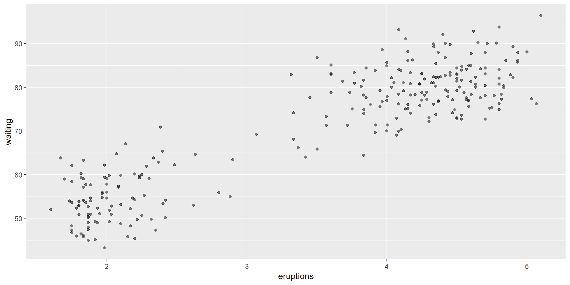
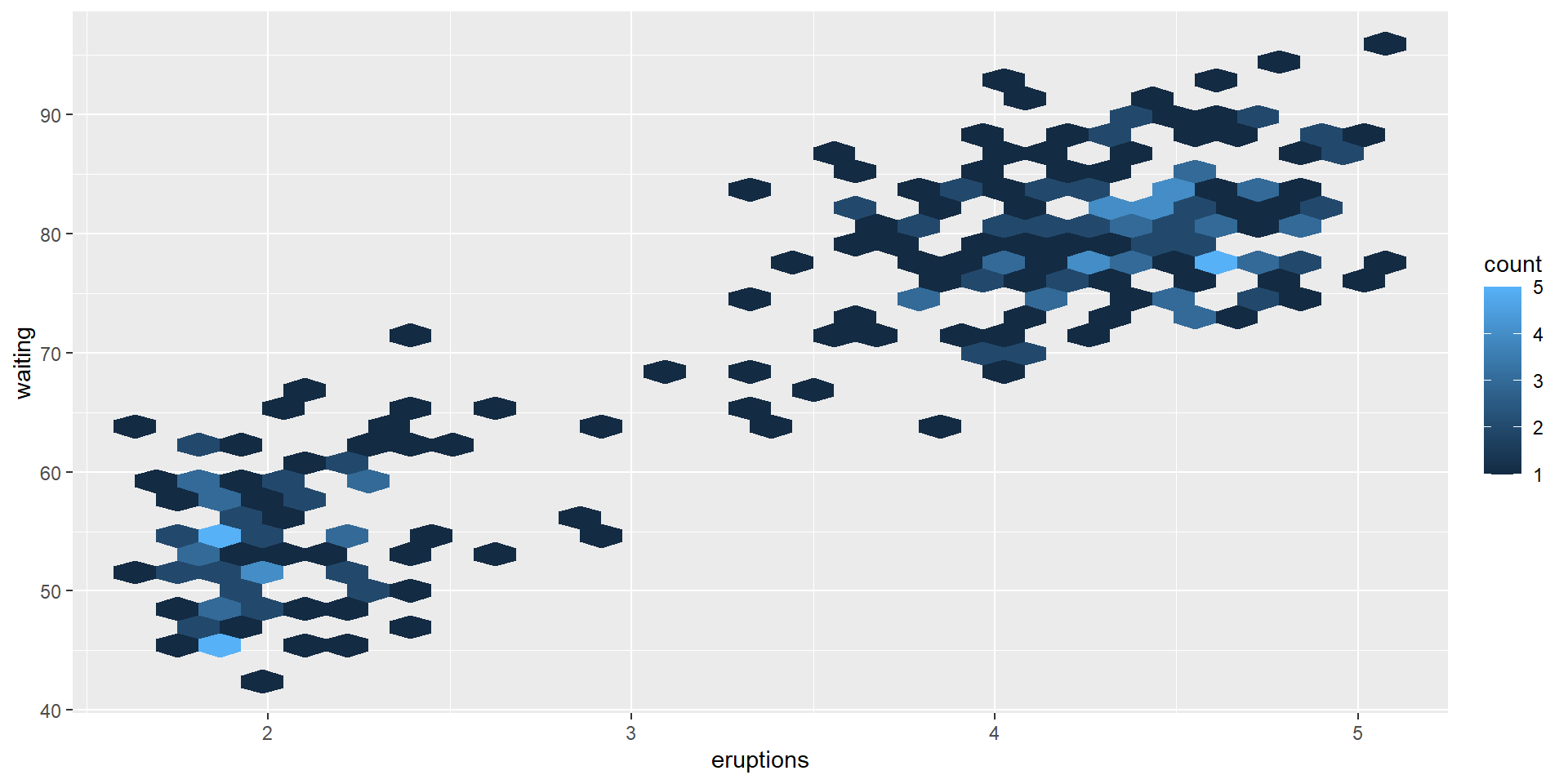
The faithful dataset (from {datasets}) contains many overlapping points. Let’s practice two different ways to make the data density clearer.
First, create a standard scatterplot of eruptions (x) vs waiting (y).
Create a second version of the plot that uses jittering and alpha-transparency to reveal hidden points.
Create a third version using geom_hex() to bin the points into count-based shapes. Note: You will need the {hexbin} library installed.
Answer key
library(hexbin)data("faithful", package ="datasets")# Version 1: Jitteringggplot(faithful, aes(x = eruptions, y = waiting)) +geom_point(position ="jitter", alpha =0.5)
# Version 2: Hex Binningggplot(faithful, aes(x = eruptions, y = waiting)) +geom_hex()
*Note that you can click the three-line (hamburger) icon on the bottom-left of the slides to access a navigation menu. You can click inside the slides region and press the left and right arrow keys on your keyboard to advance and reverse the slides and animations.
Practice
1) Mapping the World
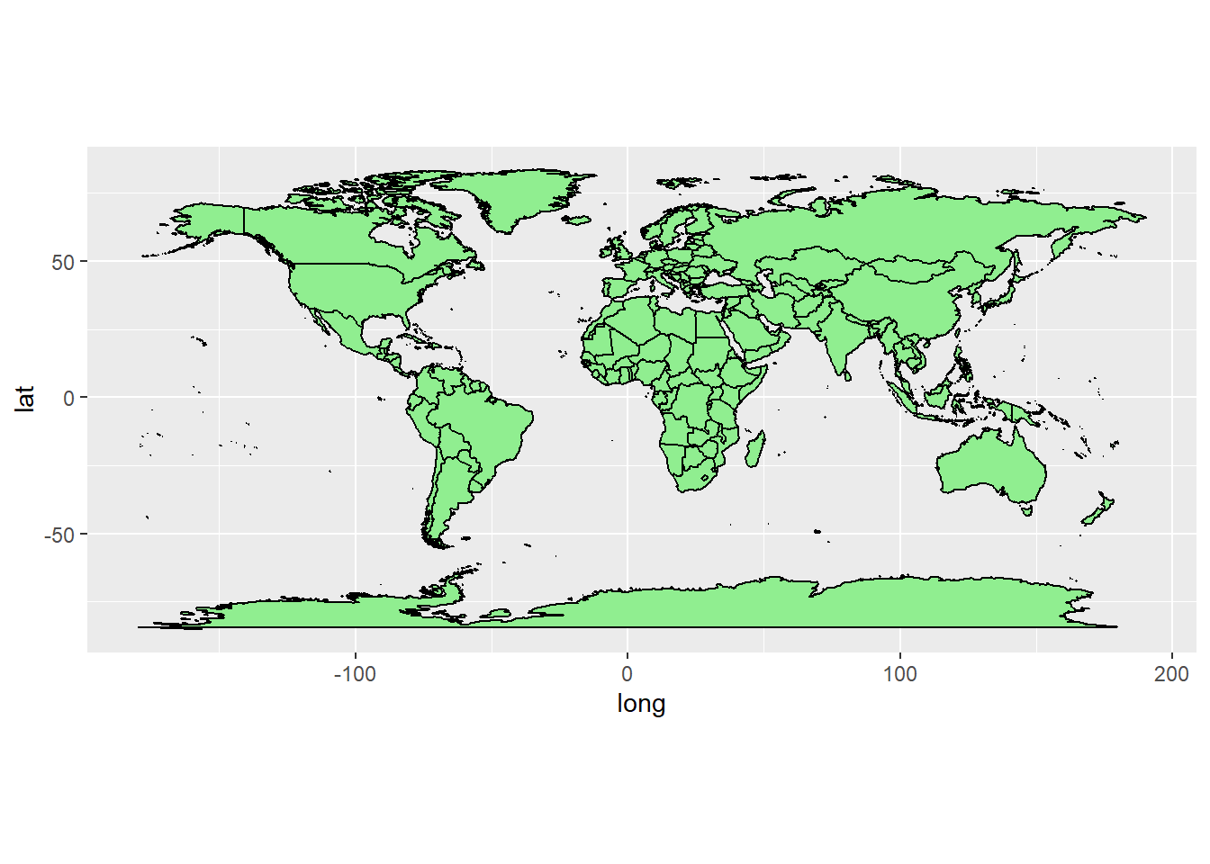
Let’s practice drawing a map of the entire world using the {maps} package.
Extract the coordinates for the world map using map_data("world") and convert it to a tibble.
Create a ggplot mapping the long (x), lat (y), and group aesthetics.
Add the map polygons using geom_polygon(), setting the fill to “lightgreen” and the outline color to “black”.
Apply coord_quickmap() to fix the geographic distortion.
Answer key
library(tidyverse)library(maps)## ## Attaching package: 'maps'## The following object is masked from 'package:purrr':## ## map# Extract the world map dataworld_map <-map_data("world")# Draw the mapggplot(world_map, aes(x = long, y = lat, group = group)) +geom_polygon(fill ="lightgreen", color ="black") +coord_quickmap()
2) Pinpointing Global Cities
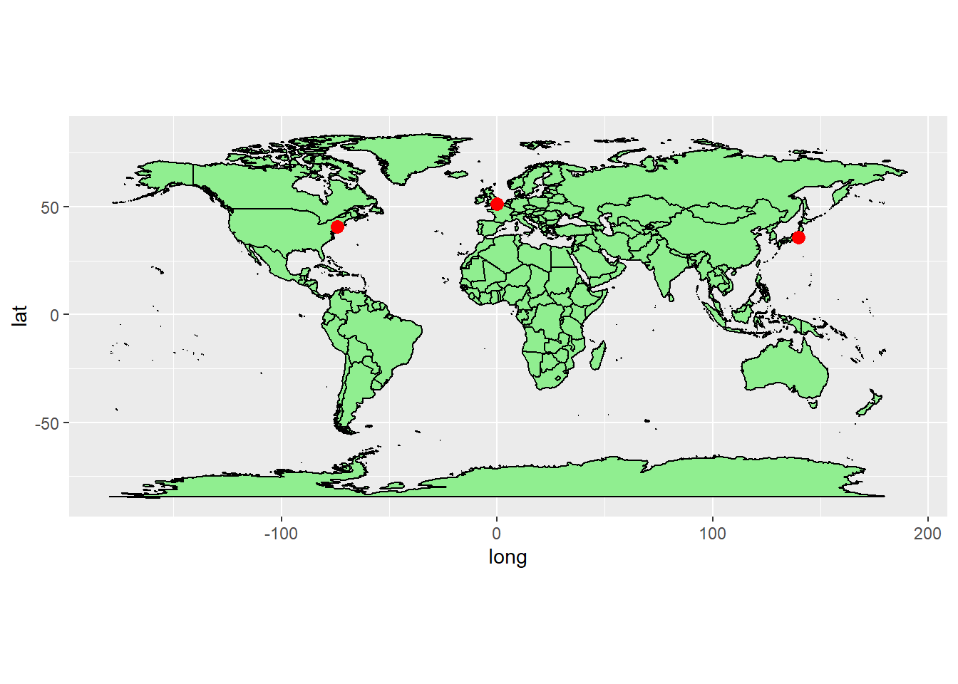
Now let’s add some points to our world map to represent major global cities.
Run the provided code to create a small dataset of three cities.
Start with your world map code from the previous question, but move the mapping aesthetics into the geom_polygon() layer so they do not conflict with the points.
Add a geom_point() layer using the new cities dataset.
Map long to x and lat to y for the points, and set their color to “red” with a size of 3.
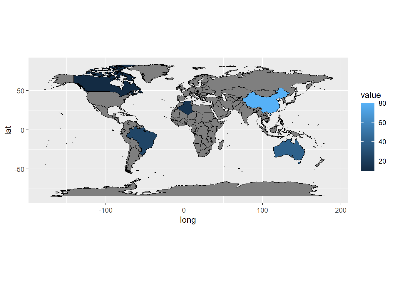
# Join the dataworld_joined <- world_map |>left_join(country_data, by ="region")# Draw the choroplethggplot(world_joined, aes(x = long, y = lat, group = group)) +geom_polygon(aes(fill = value), color ="black", linewidth =0.3) +coord_quickmap()
[13c] Themes
Topics
Apply complete themes to rapidly change the look of plots
Customize individual theme elements for fine-grained control
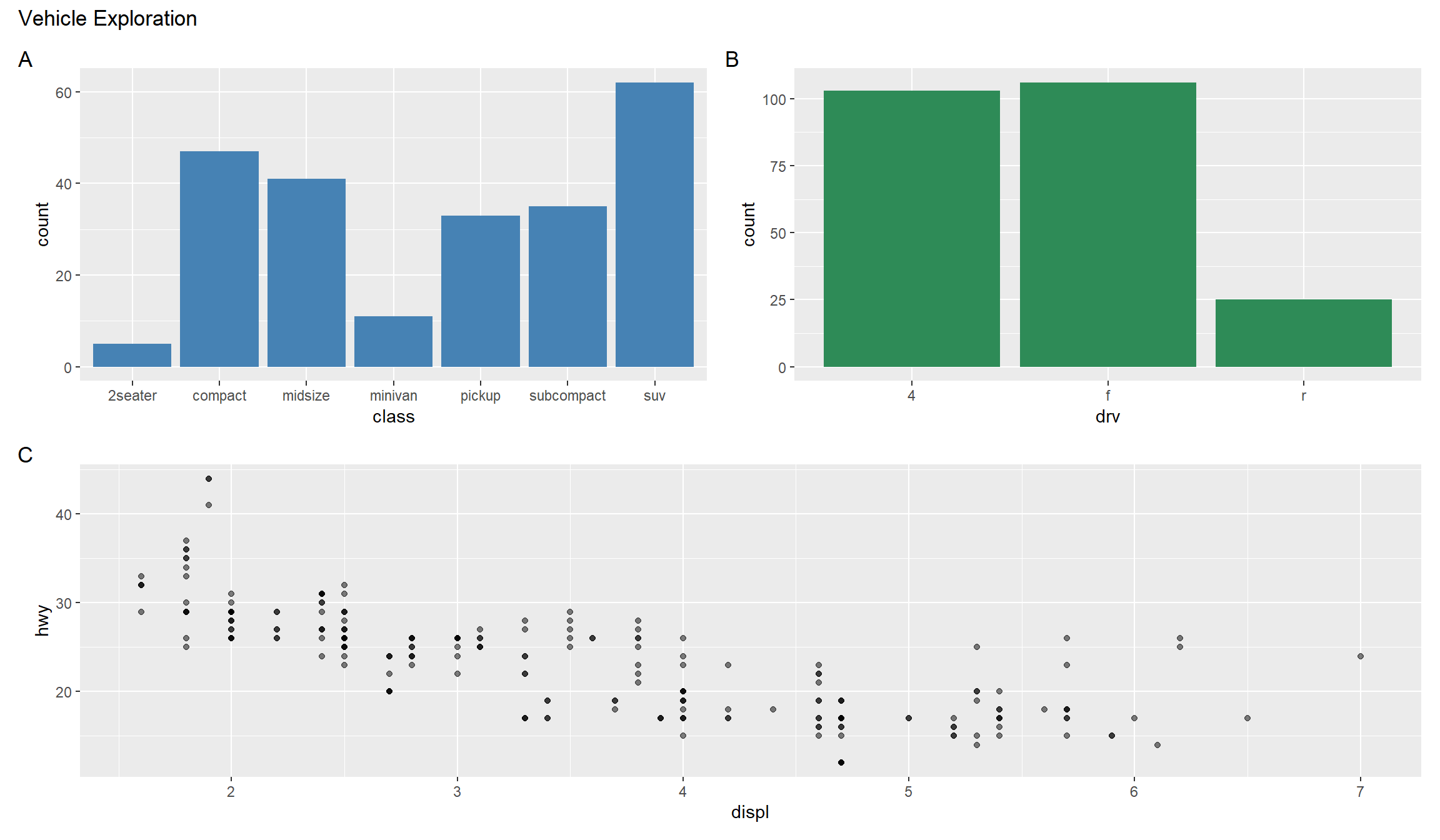
Combine multiple plots into complex layouts using patchwork
*Note that you can click the three-line (hamburger) icon on the bottom-left of the slides to access a navigation menu. You can click inside the slides region and press the left and right arrow keys on your keyboard to advance and reverse the slides and animations.
Practice
1) Applying Complete Themes and Moving Legends
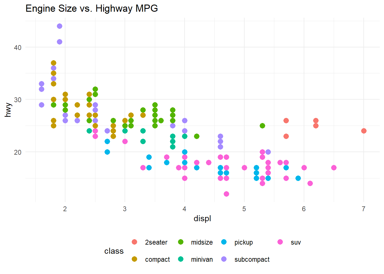
Let’s practice applying a built-in theme and adjusting the legend position for a cleaner look.
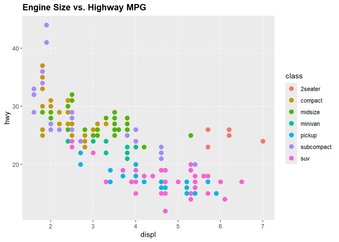
Run the provided code to create a base plot p_base using the mpg dataset.
Apply the theme_minimal() complete theme to p_base.
Use the theme() function to move the legend to the “bottom” of the plot.
library(tidyverse)p_base <-ggplot(mpg, aes(x = displ, y = hwy, color = class)) +geom_point(size =3) +labs(title ="Engine Size vs. Highway MPG")