
Customizing the Hierarchy Diagram
Source:vignettes/ackwards-visualization.Rmd
ackwards-visualization.Rmdautoplot.ackwards() exposes a large number of arguments
for controlling the appearance of the hierarchy diagram. The diagram
shows the factors at every level of the hierarchy, where a factor is an
unobserved dimension that explains why a set of items correlate. This
vignette is a visual reference. Each section demonstrates one group of
arguments with rendered figures, so you can see the effect before
writing any code.
All options shown here are presentation-only. They
do not change which factors were extracted or how the between-level
correlations were computed. Options that change which nodes
appear (drop_pruned, compress_levels) are
specific to the Forbes pruning extension and are covered in
vignette("ackwards-forbes").
Setup
The default diagram for reference:
autoplot(x)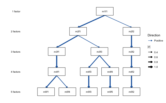
Factors are labeled m{k}f{j} (level k, factor j). Two
edge aesthetics carry the between-level correlations, and each one comes
with its own legend. Arrow thickness encodes the
magnitude |r|, and edge color encodes the direction
(blue = positive, red-orange = negative). Level labels on the left count
factors per level.
Primary-parent edges are always positive after sign alignment. A red (negative) edge is therefore a genuine secondary relationship, not an artifact.
Encoding sign and magnitude
You choose which aesthetic carries which piece of information.
sign_by picks the channel for direction and
magnitude_by picks the channel for |r|. No aesthetic is
ever mapped without a matching legend.
sign_by: how direction is shown
sign_by = "color" (the default) uses
color_pos/color_neg. "linetype"
draws positive edges solid and negative edges dashed, which frees color
for a single-hue figure. "both" uses color and
linetype together. Negatives get a distinct double-dash so they still
read in greyscale, and the two are merged into a single “Direction”
legend. "none" drops sign encoding entirely.
autoplot(x, sign_by = "linetype")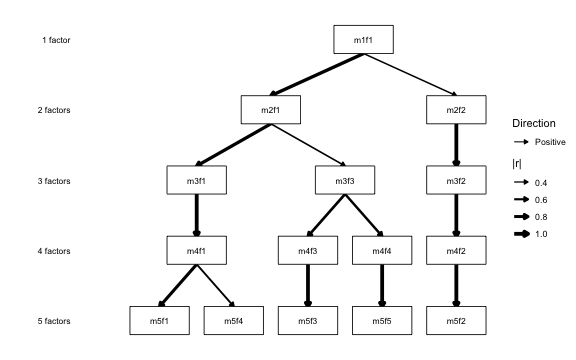
autoplot(x, sign_by = "both")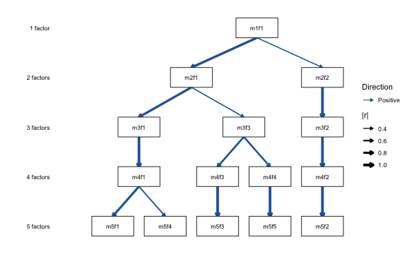
magnitude_by: how |r| is shown
By default magnitude_by = "linewidth" maps |r| to arrow
thickness with a |r| legend. Set
magnitude_by = "none" for uniform-width edges (see also
edge_linewidth, below, to pin a specific width).
autoplot(x, magnitude_by = "none")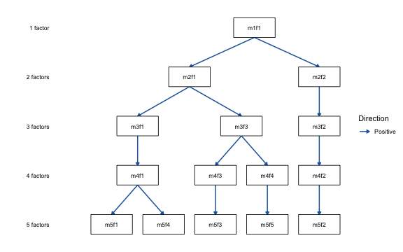
Filtering edges
cut_show: minimum |r| to display
Edges below cut_show are hidden entirely. Raising it
produces a sparser diagram that emphasises only the strongest
connections.
# Default cut_show = 0.3 (already shown above)
autoplot(x, cut_show = 0.5)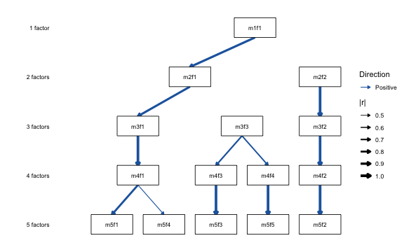
Edge colors
color_pos / color_neg: custom direction
colors
The default blue/red palette can be replaced with any colors
recognised by R. British spellings (colour_pos,
colour_neg) are accepted as aliases.
autoplot(x, color_pos = "darkorchid", color_neg = "darkorange")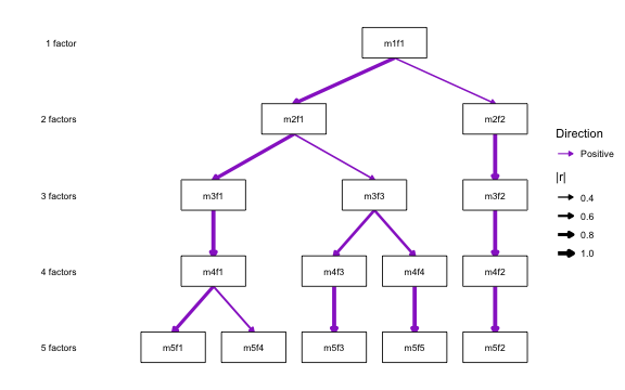
When sign is not encoded by color
(sign_by = "linetype" or "none"), all edges
take the single color_edge (default black). That is the
basis for the Forbes (2023) publication style (see the worked example at
the end of this vignette).
Monochrome mode
mono = TRUE: a black-and-white convenience wrapper
mono = TRUE is shorthand for
sign_by = "linetype" with black edges. Solid lines are
positive correlations, dashed lines are negative.
magnitude_by still applies, so linewidth
continues to encode |r|.
autoplot(x, mono = TRUE)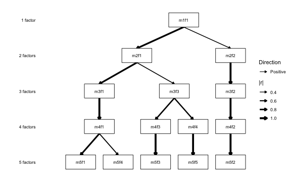
mono suits black-and-white figures where the reader must
distinguish positive from negative edges. To label the edges with their
exact values as well, add show_r = TRUE (documented
next).
Correlation labels
show_r / r_digits: annotate edges with r
values
show_r = TRUE draws the rounded (signed) correlation at
each edge midpoint. r_digits controls the number of decimal
places (default 2).
autoplot(x, show_r = TRUE)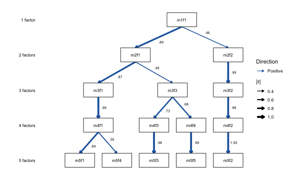
autoplot(x, show_r = TRUE, r_digits = 1)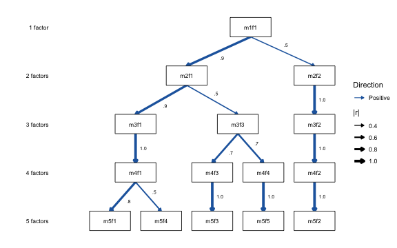
Node labels
node_labels: rename individual factors
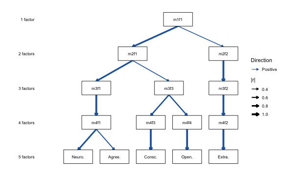
node_labels is a named character vector mapping factor
IDs to display strings. Unspecified factors keep any name attached with
set_factor_labels(), and fall back to their
m{k}f{j} labels. If you have already labelled the object
with set_factor_labels() (see
vignette("ackwards-interpret")), those names appear on the
diagram automatically. Then node_labels is only needed to
override a particular node for this one plot.
autoplot(x, node_labels = c(
  m5f1 = "Neuro.",
  m5f2 = "Extra.",
  m5f3 = "Consc.",
  m5f4 = "Agree.",
  m5f5 = "Open."
))
Multi-line labels are supported via \n:
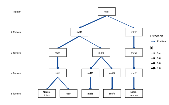
node_width / node_height: size individual
boxes to fit a label
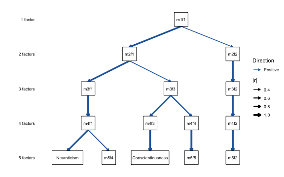
A long substantive name may not fit the default box.
node_width and node_height each accept a
named vector keyed by factor ID, which sizes those
boxes individually. Boxes you do not name keep the default. Increase
min_sep to make room when a box grows wider than the
spacing between siblings.
autoplot(x,
  node_labels = c(m5f1 = "Neuroticism", m5f3 = "Conscientiousness"),
  node_width = c(m5f1 = 1.8, m5f3 = 2.2),
  min_sep = 2.4
)
label_template(): generate the scaffold
Typing out every factor ID is tedious for large objects.
label_template() generates the full named vector in
canonical diagram order and prints a copy-pasteable c(...)
literal you can edit and pass back to node_labels. It also
offers the Forbes (2023) letter convention ("A1",
"B1", "B2", …) as a built-in style:
autoplot(x, node_labels = label_template(x, style = "forbes"))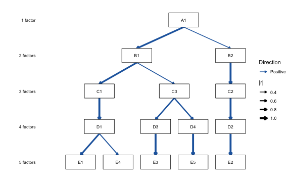
For the full naming workflow (reading factors, the sign convention,
and choosing labels across the hierarchy) see
vignette("ackwards-interpret").
Item content
show_items: list the items under the deepest-level
factors
For a publication figure it helps to show what each
most-granular factor is made of. Set show_items = TRUE to
list the salient items beneath each deepest-level (k_max)
box. It shows the top n_items by |loading| at
or above item_cut, using the same extraction as
top_items(). Variable labels appear when the data carried
them into the fit. Here na.omit() stripped
bfi25’s label attributes, so the item IDs are shown. See
vignette("ackwards-interpret") on keeping labels.
autoplot(x, show_items = TRUE, n_items = 4)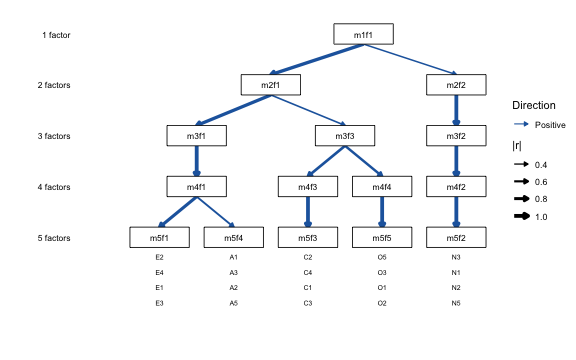
Structural simplifications
primary_only = TRUE: show only primary-parent
edges
Setting primary_only = TRUE keeps only the single
strongest edge per factor (its primary parent), which produces a clean
tree. Because skip-level edges are never primary, this also suppresses
curved arcs when pairs = "all" was used.
autoplot(x, primary_only = TRUE)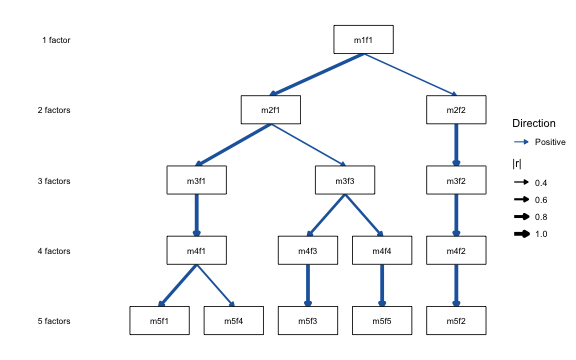
order: arrange the deepest level by hand
The layout orders factors automatically to minimise edge crossings.
But you may want a specific left-to-right arrangement, to match a paper
or to untangle a figure. order fixes the order of the
deepest (k_max) level. Supply that level’s
factor IDs in the desired order. Every factor above stays centred over
its primary children, so fixing the leaf order rearranges the whole tree
coherently. Any arrangement of the hierarchy is reachable this way.
# Reverse the deepest level's left-to-right order
deepest <- paste0("m5f", 5:1)
autoplot(x, order = deepest)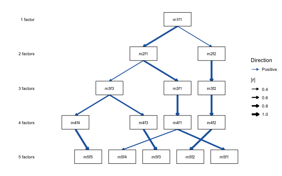
drop_pruned + show_secondary: the pruned
view and its hidden correlations
Pruning (see vignette("ackwards-forbes")) flags
redundant factors, factors that persist across levels without changing.
drop_pruned = TRUE then renders the reduced hierarchy,
joining each retained factor to its single strongest surviving ancestor.
That primary view hides every other between-level correlation.
show_secondary = TRUE adds them back: each kept cross-level
pair with |r| >= cut_show that is not a primary edge.
They are drawn dimmed and thinner beneath the primary arrows, so the
sign colors stay intact. These are a factor’s weaker second parents
and direct skip-level correlations the primary path would
otherwise obscure. A skip-level |r| is its own fact: correlation is not
transitive, so it need not equal the product along the path.
xp <- prune(x, "redundant")
#> ℹ Redundancy pruning (direct criterion, |r| ≥ 0.9) flagged 6 nodes.
#> ℹ Nodes are retained in the object; inspect with `x$prune$nodes` and
#>   `x$prune$chains`.
autoplot(xp, drop_pruned = TRUE) # primary view: one ancestor per factor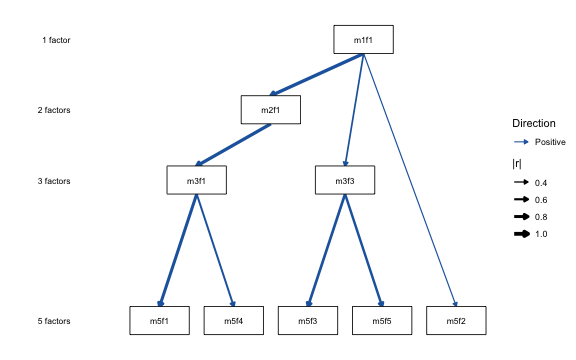
autoplot(xp, drop_pruned = TRUE, show_secondary = TRUE) # + secondary correlations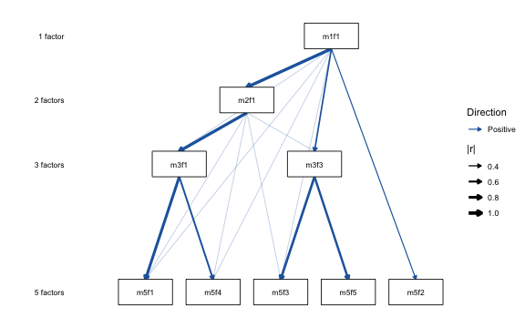
Level labels
show_level_labels / level_label_size
Level labels (“1 factor”, “2 factors”, …) are shown by default on the left margin. They can be hidden or resized.
autoplot(x, show_level_labels = FALSE)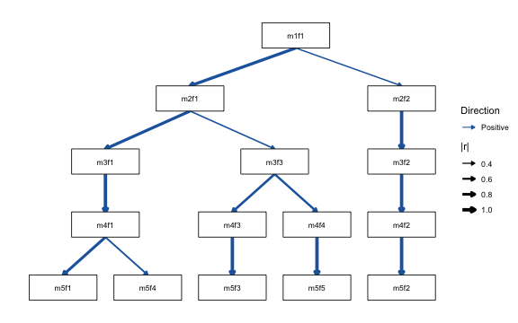
autoplot(x, show_level_labels = TRUE, level_label_size = 4)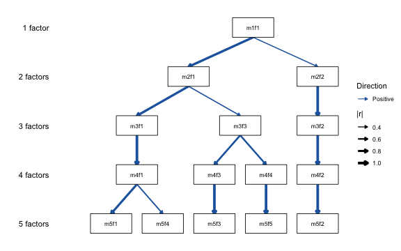
Arrowheads
show_arrows = FALSE: plain line ends
By default, edges end with closed arrowheads. Setting
show_arrows = FALSE draws plain line ends. This applies to
both straight edges and curved skip-level arcs.
autoplot(x, show_arrows = FALSE)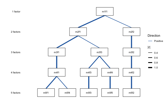
Edge width
edge_linewidth: uniform vs. |r|-scaled width
By default, edge width is proportional to |r| (via
magnitude_by). A numeric edge_linewidth draws
every edge at that constant width and removes the |r|
legend. It works like magnitude_by = "none", but at a width
you choose.
autoplot(x, edge_linewidth = 0.7)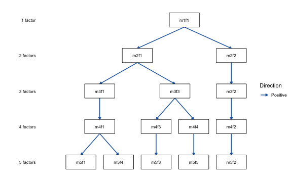
Layout orientation
direction = "horizontal": left-to-right layout
By default levels stack top-to-bottom (level 1 at top).
direction = "horizontal" lays them out left-to-right (level
1 at left), which fits wide slides and posters. The level labels move to
the bottom margin.
autoplot(x, direction = "horizontal")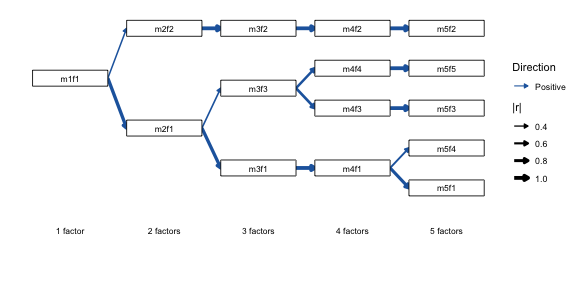
Legend
legend = FALSE: suppress all guides
legend = FALSE removes all legends from the plot. It is
most useful when the diagram is self-explanatory or the legend
duplicates information conveyed by labels.
autoplot(x, legend = FALSE)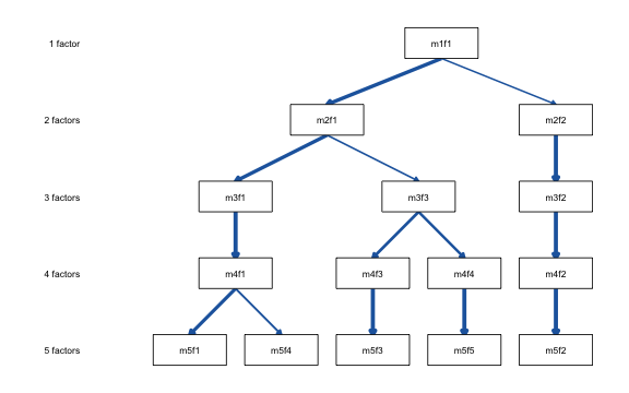
Worked example: publication-ready figure
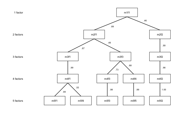
The following call reproduces the visual style of Forbes (2023):
black lines of uniform weight, plain line ends, correlation labels, and
no legend. Setting both direction colors to black yields a single-hue
figure, and legend = FALSE suppresses the now-redundant
key.
autoplot(x,
  color_pos      = "black",
  color_neg      = "black",
  edge_linewidth = 0.6,
  show_arrows    = FALSE,
  show_r         = TRUE,
  legend         = FALSE
)
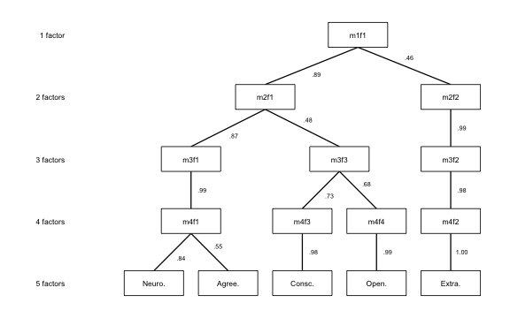
Combining with node_labels names the factors for the
final figure:
autoplot(x,
  color_pos = "black",
  color_neg = "black",
  edge_linewidth = 0.6,
  show_arrows = FALSE,
  show_r = TRUE,
  legend = FALSE,
  node_labels = c(
    m5f1 = "Neuro.",
    m5f2 = "Extra.",
    m5f3 = "Consc.",
    m5f4 = "Agree.",
    m5f5 = "Open."
  )
)
For the pruned-factor variant of this figure (nodes omitted, spanning
arrows) see vignette("ackwards-forbes").
Saving plots
autoplot() returns an ordinary ggplot
object, so save it with ggplot2::ggsave():
p <- autoplot(x, direction = "horizontal")
ggplot2::ggsave("hierarchy.png", p, width = 9, height = 5, dpi = 300)
ackwards does not re-export ggsave(),
because that would move ggplot2 from Suggests into Imports.
Call it from ggplot2 directly.
Diagnostic scree / criteria plot:
autoplot.suggest_k()
suggest_k() also has its own autoplot()
method. It produces a multi-panel diagnostic with a scree plot, parallel
analysis (which keeps a factor only when it explains more variance than
random data would), and VSS. It is documented in depth in
vignette("ackwards-suggest-k"). Here we only show that the
same autoplot() generic covers it.
sk <- suggest_k(bfi, seed = 42)
#> ℹ Running parallel analysis (20 iterations, PC + FA)...
#> ✔ Running parallel analysis (20 iterations, PC + FA)... [100ms]
#>
#> ℹ Running MAP and VSS...
#> ✔ Running MAP and VSS... [33ms]
#>
#> ℹ Running Comparison Data (CD)...
#> ✔ Running Comparison Data (CD)... [3.9s]
#>
autoplot(sk)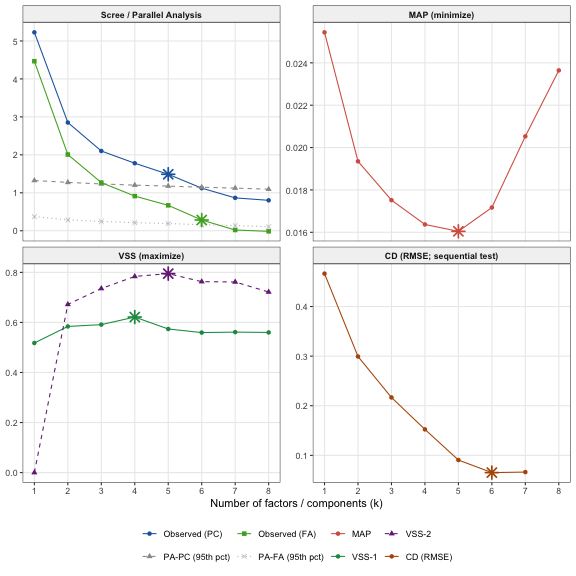
References
Forbes, M. K. (2023). Improving hierarchical models of individual differences: An extension of Goldberg’s bass-ackward method. Psychological Methods. https://doi.org/10.1037/met0000546